This workflow elegantly solves the bottleneck of data latency, transforming overwhelming scale into immediate, actionable clarity. It is a masterclass in how high-speed rendering can elevate raw information into a sophisticated visual dialogue.
Install our extension to search inside any video instantly.
High Speed Analysis And VisualizationAdded:
Hello, this is Tony Heller from Visitek.ai.
We built the world's fastest data analysis, visualization, and presentation tools.
Over the next few minutes, I'm going to show you an example which would have taken hours by any other means.
We're going to analyze violent crime in Washington, D.C. this year.
Visitek works with almost any type of data, but this is one example which is easy to understand.
You're looking at a map of the 751 violent crimes which have been reported in Washington, D.C. so far this year.
This image shows the police report of the details of one of those crimes. It also shows the location where the crime occurred.
And this is a Google Street View of the exact location of the crime.
This animation shows how violent crime has been increasing week over week in Washington, D.C.
Now, let's go over to Visitek.ai and see how these graphics were created.
This is what the interface looks like for subscribers.
I'm going to select one of the data sets.
Data sets, crime, Washington, D.C., D.C. crime 2026.
Now, we have a map of all 5,854 crimes which have been reported in Washington, D.C. so far this year.
This data was downloaded from the Washington, D.C. Metro Police.
What I'm interested in though is violent crime, so I'm going to click on the microphone button.
Violent crime.
Now, we have a map of the 751 violent crimes which have been reported in Washington, D.C. this year.
There's a lot of them down in this area, so let's take a closer look.
I'm going to right click and drag a rectangle around that area.
Now, I'm going to zoom in a little bit further using the mouse wheel.
Now, I'm going to left click on this crime scene to bring up the details.
Next, I'm going to middle click to bring up Google Street View.
Now, we can pan around and see exactly what this neighborhood looks like. I showed you four graphics at the beginning and we've already created three of them.
The fourth graph was counting the number of violent crimes per week.
I made this one easy by making it a preloaded suggestion. I'm going to click on this and then click on send.
Now, we have a graph showing the number of violent crimes increasing week over week in Washington, D.C.
Now, I'm going to change this into a bar chart.
And I'm going to change the background to dark.
I want to make the graph a little bit wider and put axis labels on it.
We add the axis labels by clicking on the options tab.
I entered the main title, horizontal axis title, and vertical axis titles down here.
We've got the basic graph, so now let's create the animation by clicking on edit.
This opens up a new tab where we can create the animation.
This looks like a fairly typical paint tool, but has some special features.
The first thing I'm going to do is X out the zoom window.
Then, I'm going to increase the contrast to get rid of the grid lines. I want to replace them with a background color, so I'm going to click on eyedropper and select the black background.
Next, I'm going to click on the bucket tool.
I'm going to get rid of the bars one at a time from right to left.
If you notice at the bottom, a new frame is appearing each time I click.
The frames are in the wrong order because I created them from right to left, but I want the animation to go from left to right, so I'm going to reverse the order of the frames.
The last step is to simply click on export GIF.
This downloaded an animated GIF which we can see by clicking here.
In about 3 minutes, we did a huge amount of data analysis and created some nice presentations.
As I mentioned earlier, doing this by any other means probably would have taken hours.
And we can get the details of every single violent crime which has occurred in Washington, D.C. this year.
You can do this analysis using Visitek on just about any type of data, but this is an easy one to understand. Our product is starting to get some pretty significant attention, which I'll be reporting on in the not very distant future.
It won't be long until you start hearing a lot about Visitek.ai.
Related Videos

Agentforce NOW AMA: Build with React and Salesforce Multi-Framework
SalesforceDevs
490 views•2026-05-28

How agent o11y differs from traditional o11y — Phil Hetzel, Braintrust
aiDotEngineer
450 views•2026-05-28

WEB TECHNOLOGIES UNIT-2 | Degree 4th sem BCOM Computers web technologies unit-2 full explanation💯✅
LearnwithSahera
1K views•2026-05-29

More tests are always better? How to use AI to identify tests that bring little value
Alliance4Qualification
335 views•2026-05-29

Search Algorithms Explained in 60 Seconds! 🤖💨
samarthtuliofficial
218 views•2026-06-01
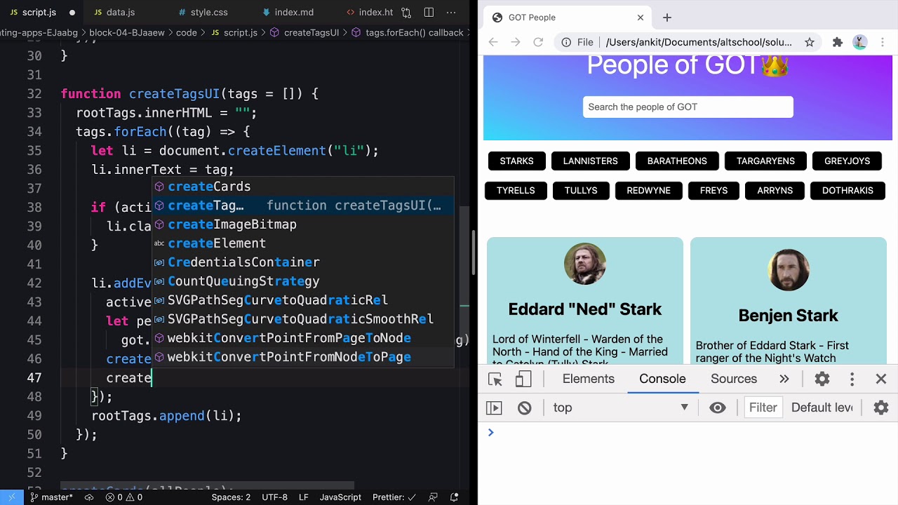
People of Game of Thrones using JavaScript DOM
AltCampus
296 views•2026-05-30

Introduction to Problem Solving Part - 1 | Lecture 1 | Intermediate DSA
ascensionix
107 views•2026-05-29

🚀 BCS613C Compiler Design | Module 1 to 5 Schema Evaluation 🔥 | VTU 6th Sem 💯 #VTU #bcs613c #exam
Pranavaa-y4y
104 views•2026-06-02