This tutorial demonstrates how to build a complete webpage layout including a header with navigation, a hero section with heading, subheading, and buttons, and a dropdown menu that appears on hover. The key techniques include using CSS Flexbox for alignment, applying multiple background images with linear gradient overlays, styling buttons with primary and secondary variants, and creating responsive column layouts for sections like features, services, and blog posts. The dropdown menu is implemented using CSS hover effects with position absolute and display properties to show/hide the submenu.
Install our extension to search inside any video instantly.
HTML & CSS Layout Assignment Level 2: Hero Section with DropdownAdded:
all right guys here we have our assignment level 2 in the creating list topic let's see what we have to create here all right so here inside this assignment we have to create this layout let's go from top to bottom this is our header our hero section and few different sections all right and at the end we have our footer and there is one more thing about this layout that we have one drop down also so let's see how our drop down looks like so our drop down looks like something this so if we hover over this link we will find a drop down all right so to create this layout i have taken a folder here assignment level two inside this folder we have our index.html with the standard html document and inside the css file we have css resets at the top and few normal styles to our page and there is a container of max with 1320 pixel so if we look at our page here it looks something like this that right now we don't have anything on our page so let's get started so let's see here once again so here we have our header so first of all let's take one header tag inside the header let's take our container and let's take anchor tag saying what's that elevation and after the anchor tag let's take one nav ul li anchor here we are having home page layouts and elements let's say here home page layouts and and then we have elements now save our file here let's give it a refresh here all right here we have now we need this elevation as well as all of these navigation apart from each other so we'll use plex class that we have already taken so to the container let's apply flex save it to face apart from each other and similarly we also need this home page layout and elements in a single line so let's say here flex actually we haven't taken elements inside an anchor tag yeah now it is a link here we have now let's style our navbar so let's start applying classes nav bar here first of all nav bar will save adding top and bottom 32px and left and right zero yeah so far that's fine give it a refresh here we have and the navbar a first of all to text decoration instead of this a here let's never let's target our anchor tag so from here let's style our general and here let's target our anchor here say text decoration so we don't have to apply this thing again again now give it a refresh here we have and then we'll say font size of 20px 20px and text transform uppercase have a look perfect okay let's make it 18 px and font weight of save 600 perfect now let's see our brand here so for the brand let's apply one class brand all right so now let's target this brand class here let's increase the font size a bit we'll say 24 px and font weight of 700 now save it give it interface now changes the c okay actually we have targeted naba a so this navbar a is more specific than this just a brand so let's make it more specific and this never is so we'll say nabba brand now save it then give it still there is no changes what can be the reason okay we are not saving our index.html file now let's give it a difference all right so this is fine okay perfect so now we do a here we have number a so we'll target our here nab ally will say margin left of 32 px perfect all right so we are done with this nap bar for now but again we'll come back to style this for example we we need to change the color but before that let's style our hero section first and then we will take this navigation bar on top of this hero section saying position relative absolute or fixed anything so now first of all let's get into our main section tile our hero section then we will again come back for header section so after the header let's take one main tag section inside the section let's take one container and inside the container let's take one h1 tag lauren if some dollar and one more sub heading we can say let's say h oh this time something different let's use from here nice and there after we have one button so first of all let's see our pc here we have and let's take one anchor tag for this button so let's see right now let's keep it this keep this blank and the same magnum what you say okay yeah have a look here we have now we'll style our hero section so let's start applying classes say class hero and then hero heading here class hero subheading and for the anchor tag and all button let's see our page here so here we have that button let's see how many types of button we have so far here we have another button another button okay we have two types of button actually so we'll create we'll take first of all a general btn class then accordingly uh between primary and between secondary so first of all let's take class here btn so far and let's keep it inside our general so from here differentiate this is our navbar okay then here let's say btn will save padding top and bottom 12px and left and right say 56 px let's make it 10 actually and we'll say let's see here once again our buttons is it every buttons is in uppercase so let's see clicks transform uppercase font size let's keep it 16px and and text align center display line block save it let's have a look here okay and what do we have again so let's this is our primary button so here let's take one more class btn primary so btn and for the btn primary we have some different background so let's say background color here this background actually save it and we have color white for the primary button perfect now let's give it a replace see no changes let's save our index.html file first now give it replace so here we have perfect let's say font to it say say 100 yeah this is fine okay we are done with the btn primary all right so now let's get let's style this hero heading and hero sub heading first so from here we'll start our hero section hero hero heading we'll say font size of 44 px and color is white and thereafter we have yeah so far that's fine okay text transformer pokes have a look here okay we do not see that actually we are having same background color as well as same color so first of all to the hero let's apply what background color here we have actually to the hero we have one background color as well as background image also so let's combine our color as well as image here so for the combining we have one facility that we can apply multiple background image at the same time so we need multiple background image but at the same time we need this color also so for that purpose for the color we will be using linear gradient and the both the color inside the gradient will be same and there will be one image so now let's target our hero section to that hero section we will be applying multiple background images so here we have hero and i've also taken few media files with banner svz that's the banner svg that we are going to use for this hero section and thereafter we have different different images all right so first of all let's use background property here and let's say linear gradient saying which color this color actually so let's see here all right so paste it paste it and after applying comma just get it your bit okay applying comma will say url we have media banner.svg alright so we have here here we have that banner.svg that we are going to use as a background image for the hero section actually we have different different formats of images we have already seen few images a format that is png jpg etc there is this is the svg is the new format that we are that we will see inside adding media topic will go in detail about the svg but for now just think it as a normal we have png format we have jpg format similarly we have svg format now save it let's give it a refresh here we have we see the background in color but we do not see the background image so actually so as we know when we apply multiple background image the image which comes first that will be working as a foremost background image so that's so that's why here linear gradient this color is working as a foremost background image that's why this banner svg is below this background image that is linear gradient so what do we need now first of all we inspect our hero section here we'll get the svg actually not svg will get the rgb a value for this clock that is 50 51 let's copy here and say here and similarly here also and after we need comma 0.7 let's say and here it will be alpha value so similarly here also zero point seven zero here it will be alpha now save it then give it a refresh let's see here okay still is our image okay so first of all let's apply some padding top and bottom will save htpx left and right zero give it a refresh uh one thing we can do we do not see this image still so let's call it say no repeat and background size cover save it and go to refresh no change we do not see that uh svg image the ceo let's keep it before the linear gradient actually and then we'll see whether we are getting that image or not actually interface okay now we can see that image actually this image is also transparent so that's why we do not see so one thing we can do instead of this applying rgb let's see keep it one and here also one now let's see how it looks yeah we got that perfect design here that we have here now we just need we do not need this it should be repeating okay fine and it should be repeating only in x direction so we'll say repeat x all right which we face that's fine okay you can also get rid of this background image background size power let's see how it looks yeah this is fine okay guys so now we need that some more padding from top and bottom let's say here 180ft this will work fine i hope so this is fine and this background image it should be the background so we need at the bottom so there is one property we already know that is background position so for that purpose background position on the like so we apply background position at before background repeat when we are using background shot and property so the background position property values uh we need from horizontal direction that should be zero but on the vertical direction fifty percent not fifty percent it should be hundred percent actually yeah now let's have a look yeah so here we are at the bottom actually we if we want we can also we can increase padding a bit more but before that before applying a more padding to our hero section first of all let's style all of these so here we have our hero now first of all let's say the color right and now let's apply text align center because we need each and everything and the center of the zero section has committed to place here we have it now let's style our hero heading and hero subheading so here we have hero heading first of all let's plat font weight 700 have a look nice we can also increase font size a bit more we can say 56 px perfect now let's get into our heroes of heading so here we have heroes of heading font size let's say 24px color that orange color yeah and then there after let's apply margin from top and bottom say 24 px and left and right zero have a look yeah this is our sub heading we can increase a bit more 32 px we can say all right so this is our hero heading hero surveying and our hero button all right guys so we are done with the hero section now let's get back into our header section here so here we have our header so we'll get this header on our hero section so for that purpose we need to send this send our header element out of the flow and snap bar it should be out of the flow so here we have our navbar so for the nav bar let's say position absolute say absolute save it let's see how it comes okay here we have that absolute now actually as we have said this position absolute so that's why now it is taking a space according to the content it's display also change so that's why it is taking space according to content now we need that it should be taking whole 100 feet for that purpose just we need to save it 100 percent give it to face perfect now we just need to change the colors what is the color that is white so here we have nabba abe just save color white all right okay guys so we are done with the header also as well as section also in the header we have just this drop down actually this is our drop down menu right now we are not going to touch this top drop down menu first of all let's complete our whole layout then we will come back again for the top run menu so now let's get into our another section here so after this section let's take another section this is our hero and this should be something let's say what can be the name okay let's say a feature section so as like each and every text is dummy text so we cannot say whatever content it is so like let's take a feature section here this will be our feature section here we can take as as a service section just like i'm just taking a name so that it should be having some meaning because from the content we cannot drive what kind of content it is and this will be our block and thereafter we have contact section and our footer so let's give it a name as a feature section to our second section here so let's see feature and inside this section let's take our container class inside the container we have one heading so let's take one h2 heading saying magna okay all right stay after we have one sub writing in a paragraph let's take another sum okay then day after after this we have different different columns so first of all let's work on this part so now let's go from top to bottom in each and every section so if you look at our each and every section we will find same kind of padding from top and bottom in this section also here also and similarly here also and then there after if you look at our header of each and every section is also having same kind of style and it's just that there is a different color for in some different section for the header so for this padding as well as for this header we'll check on general class so that we can use this thing again and again so for that purpose here let's take one theta inside the header let's keep power this header content of each and every section now save it let's see here we have all right perfect so let's start giving classes for this let's say class feature and here it will be having section retracting and let's take one more padding class for for this padding for each and every section so we'll keep each and everything inside general now so here we have padding say padding top and bottom 80 px and left and right 0 this is our padding let's see here so this is our padding and then let's target our section data the section header will say text align center first give it a difference perfect and for the heading let's take one general class again we will use this heading class for each and every sections header here here similarly here also so let's target that heading let's say font size of let's see here maybe 32px color the dark color you see five five pipe and on weight it would be 700 we are missing that pound sign here now save it then give it interface no changes we have and save our electrode html file now let's have it okay here we have we have text from uppercase uppercase and just apply margin bottom of 16 px perfect okay then puberty class so heading so we'll save just color will change the color actually right now let's say 555 but later on we will change this respect here here we have we haven't got that five five that we have applied again we forgot to save our index.html5 now let's give it this let's make it a bit light here yeah this is fine so here save it and give it interface now changes perfect now if you look at our heading we have these lines these bars so again we will not waste our time for creating this bar first of all we will complete our whole layout then we will come back for small small changes so let's get into another section now that means uh on these columns we are on the same section but now we have to create these columns so so let's get each and every column now so after this header we will take another div to this div let's apply one class saying flex because each and every item is coming in a single line so now let's take one column same class all one three and inside the first column first of all we will style the first column then we will copy and paste for the rest of the column p so let's take what we have first one i connected so we need icons so let's grab our font awesome okay it is taking time till then let's get our content that is heading of each and every section saying let's say h3 let's use termites then we have one paragraph perfect so here will be class all actually let's see here yeah here we will be using call heading class okay then for the paragraph we have same we don't have to do much thing we need the same as we are getting we need the same font size we just need to change the clip so instead of applying this color here to our uh actually sub heading what we can do let's apply this color to our body so that each and every element will inherit that color so we don't have we will not have to apply this color again and again for each and every element let's give it a refresh here okay so so far it's good so now let's get into our font awesome it is open now so we need to connect our kids copy the kit code and let's apply here font awesome and and from here our style is starting css perfect now see here no changes but the things we haven't taken anything yet so here inside the call one three the first thing we need for this icon and now we need that icon here so let's see what i can we need user first this icon let's copy the code and paste it here perfect now let's apply a class we'll say icon box okay so now we will start styling our columns so let's go here qubit refresh let's see all right so here we have our icon also now let's style our column so here we have call 1 3 from feature section call one three first of all let's apply width of thirty percent perfect and text align it would be center if you look at our sec column here each and every thing is align center okay now give it a difference here perfect so so actually we do not need this much of content so from here let's begin let's get rid of this now have a look okay we can get okay this is fine now start styling so here first of all target our icon box let's apply width of 60px and height of 60px will save border radius 50 and a font size of 20 ps give it interface okay and we need these let's make it display flex because we need our icon exactly in the center first okay for now let's get rid of this display flex first of all let's apply some background color see this color for now okay here we have all right so actually we need a background gradient actually to these icons we'll see how we can get half of the icon box is having some different color and half of the icon box color is something different so we will make use of linear gradient to make as exactly we are having this icon box so for that purpose for now instead of saying background color we'll say background property with the value linear gradient so we need two colors so those colors are let's copy the code this one first perfect and another one is this one save it now give it a replace here we are having that color but the thing is like first of all let's to our body apply padding bottom so that part of the content is coming at the bottom we can sew it easily adding bottom of 300px but we'll get rid of this padding bottom once we are done with the whole layout give it a refresh okay here we have it now as you can see to this icon box there are two different background colors are getting applied that is here we can say icon box we have two background club but the thing is that the first color is totally half and the second color is taking half of the space so we have one property that it's not property that we can apply we can actually we have learned about when we were discussing what the linear gradient or radial gradient that we can stop color or we can decide which color should stop where so let's apply 50 here as well as 50 percent here also so both of these color will be taking 50 50 percent and there will be a partition between them give it a refresh here we have now we can see there is a partition between the first color as well as second color earlier the first clue was getting fade into the second into the second color so there was some transition between them but now there is no transition both obvious both of the color is taking exactly half off of the icon box so we are done now we just need to change the direction of the color let's say 45 degree save it then give it interface perfect so as exactly here we are having on our layout same now we need this icon in white color as well as exactly in the center of the icon box so for that purpose here let's say display plugs justify content center align item set perfect and we'll change the color to white perfect now we need this in the center so how we can get that over here we are applying width as well as height we can actually save margin let's see whether it is working or not yeah here we are all right so we have our first column inside the first column hours first icon box is done done now let's get into our call heading call heading will say font size of 30 let's see here now 32 px should be just 28 px text transform uppercase color would be that black five five save it and then give it a refresh perfect so let's say font weight of say 100 yeah okay now we need just one that is just lorem ipsum here it's all right now we'll apply some margin top and bottom actually same sixteen ph top and bottom left and right zero okay cool have a look here nice now what do we need we need some border bottom to this called actually call one three let's apply border bottom of one px solid high pipe let's make two okay and let's apply the color something different actually let's inspect it make it somewhat light i think this would work fine okay let's see here yeah perfect interface here we have now let's apply some amount of padding bottom this one okay let's copy the code and for the second one here and for the third we need setting search for settings this one now save our file go to our page here then give it interface okay so we are done with the feature section of this layout now okay with our section header we need a bit more gap actually let's say 56 px maybe now this is fine all right so now let's get into our another section so this one is done after this section let's get into another section we'll make this section as service section inside the service section for the first thing we'll need container inside the container let's see here we'll copy and paste the same header as we have taken here we will just change the content section header perfect qvt refresh nice we just need to change the heading is that this one let's take something else from here save it refresh here we have and now let's apply glass to our service section let's say service and a padding class for gap around the content now let's have a look all right okay so from here we will start styling our service section very first thing to the service let's apply background color that orange this one and color of white qut interface here we have perfect now what do we need to the service section header heading now service heading actually color should be white we are over adding that color okay and then again service sub ready you see again color what now pivot interface perfect actually instead of saying this thing again and again let's copy here get rid of this perfect no changes all right now what do we need after this section header we need this column so this time we have column of 1 2 so from here after the header actually let's take one deep to this div let's apply glass of first of all flags then feature wrapper stick one deep here what do we need again icons heading and paragraph so one thing we can do is that so it's not feature is a service wrapper so from this feature section what we can take we can take actually one column from here and we will copy and paste here but this time it should be call one two okay so now let's see our page here how it looks here we have okay now let's target our call one two we'll say width of what is seven percent have a look yes okay now so what we can do here we need these all things also in text align center give it to your face and we have some different background for call one two let's see here here we are having and this is the background color okay now let's have a look alright so here we are having different background now padding top and bottom will say 32px left and right zero okay everything is fine but the thing is that let's have a look here things that we have different color for this call heading so again we'll have to target and for the icon boxes so here what we'll do say service all heading first we'll change the color to white okay and the linear gradient is something different so again surveys that i can bounce we'll say you say the same thing here as we have applied icon but the thing is that will change the color the first color will be this one yeah and the second color will be this one now paste it here save it now let's have a look here we have okay see our layout here all right we just need some amount of box shadow actually to the bottom to our call one two so let's apply box shadow of just 2px so we don't need anything on the horizontal direction the vertical direction 2px and 4px for the blur radius rgb a 0.3 or 2 here that will work fine give it a phrase okay here we have and it should be let's make just one here just three okay perfect all right so far it's fine okay so let's have a look once again here the thing is that here we are having some small amount of rep so before that let's copy and paste our different columns then we will see let's take one more column then we'll see here okay here we are having two column but the thing is that we have a large wrapper that is 1200 px no see how many what is the width of our wrapper here that's container actually okay here yeah we are having 1320 pixel of the container but what do we need we need some smaller container for for these columns so what we'll do here we have taken one class that is service wrapper we will create one another wrapper for service so let's say max speed of instead of saying 1320 this term is say 760 px save it and then we'll say margin again zero auto all right now give it a difference okay this is fine in fact we can reduce a bit more let's say her 1100 okay now let's apply padding call one two all around it's not just top and bottom all right yeah actually let's make it 44px top and bottom and we will increase the content similarly here also all right guys so here we are having two more items inside the service so let's copy all one two here here once again have a look okay all of these are coming in a single line just because we made flags and we have applied width of 47 but these all items are not getting 47 percent it's just because this is flexible now we just need to say wrap so let's go to our general section here is our flex here let's take one class wrap so wherever we will need wrapping the items so we'll apply this class so we'll say flex wrap wrap so we need here actually to our service wrapper let's see now these items will take actual width that we have applied interface all right now we just need to say some amount of gap between these two i between the items so top and bottom will say is our call one two here we have call one two will say margin top and bottom the same 16 px and left and right zero all right we can actually increase just make it 20.
okay this is fine now let's have a look here all right we just need to change the content that heading as well as these icons so let's change the icon first let's go here font awesome actually there's a diff search for graph actually what kind of graph do we need actually this one copy it then for the first column one two paste next we have setting so here then we have this computer okay check this one this one or this one have a look and just take this one again this one is also done then at the end we are left stigma so let's search for tick all right guys so we are done with all of these icon now save it go to our page here and then give it a replace let's see yeah here we have our graph icon settings that laptop or computer or desktop we can say and then here we are having checking all right so let's have a look what do we need here i think we are done with this section also but the thing is that we are left with this heading or content part that is not necessary that just take we can change it anytime now we will move into this section that is our blog section so after this section service will take another section so let's comment out here that is blog so let's depend class also block and that padding container and inside the container we have three column again so let's take deep okay before that we have heading also so before that let's grab our section header this one and this time we do not have this sub heading save it let's have a look here perfect so here we are having whatever so okay all right so after this header we need our div that is flex and inside these we need three quality class call one three all right inside the column three we have one image then after one heading and paragraph and a button so let's take img sets media with 01.png we have alt attribute let's say lady with camera and after the image we have heading so actually we can copy and paste from all one three from here yep now give it a refresh let's see what we have here we have but the thing here we are having everything but the thing is that inside the call one three as we have applied if you look at here there's a border bottom but here we don't need that border bottom so what we can do here this is our blog so let's overwrite that so from here let's style our blog blog all one three border bottom zero give it a refresh okay it is gone now but we need one button so after the paragraph let's take anchor tag we'll be saying learn more you'll be applying same class that btn that we have already taken give it to the face okay here we have part for our secondary butter now so here we have btn primary where it is here now let's do ptn second you say border 2 pixel solid not white it should be 5 5 and color also now save it let's have a look here okay no changes just because we haven't applied that btn second class vtn secondary now have a look perfect now what do we need we need some margin to this button so we can target our blog button actually here blog btn will say margin from top 16 px okay then instead of saying let's say 24px yeah this is fine let's have a look here okay everything is fine we just need all of these columns so before that one thing will make our images with hundred percent block img with hundred percent so that it should be contained inside the column only okay now okay so let's copy and paste this call one three two times more save it then give it a replace everything is fine now just change the image so this will be big three and this will be pix02 save it pix02 is typewriter so inside the alt attribute let's define typewriter and with the last image let's see or alpha now save it then give it a refresh perfect we have typewriter and mobile phone change the heading also here second heading is you can take anything let's say areas and okay here we'll say now save it then give it okay here we have our heading also okay there's something this is our landmark only but here we are having that all right so if you look at our page here we are done with this section also that is block section now we just need to work on the contact section thereafter footer so okay let's see our button actually this some we don't need this dark color we need somewhat grease or somewhat light so let's see here this one is fine got a color actually so let's target our btn secondary here but anyways our sub btn secondary okay here we have that btn secondary yep this is fine now now let's get into our another section that is contact section after the section let's take contact here define classes also contact and this would be padding nice container then we have section header so let's copy save it with replace here we have okay so this time we need just contact all right so here we have our section header inside the contact section now let's see what we have to create so now after these we have a form and on the right side we have few contact information so first of all let's create this form thereafter we'll create these contact information so here after the header take a div inside the div let's take one form okay and after the form let's take few input type text we have placeholder that is name then another input we are having email and type yeah placeholder actually is email there after we have one text area so inside the text area we have one placeholder with message message let's get rid of these false we'll need few rows save six rows now save it let's have a look here all right here we are as form elements are this input as well as this text area is inline level element so that's what these are coming in a single line now we need to make this as a block level element so give it a class say form control same class let's target here from here we are going to target our contact section on control first of all let's say display block width of 100 percent and see here border 1px solid gray color actually yeah this will work fine and then adding top and bottom 12px and and actually here it should be padding and here we are having from the left and right side 16 px now save it then give it a refresh okay here we have let's apply margin bottom of 16 ps okay we can increase a bit more say 24 perfect now we just need to change the placeholder click form control placeholder say that color that grease color okay and let's change the font family we'll say open sense and send save in fact oh okay cool now what do we need everything is fine okay yeah this is fine now after this we need two button here so just after the form here we have the text area we'll save d inside this tape we will take two anchor tab not to anchor tag actually we need two button so these are not navigational links these are the buttons so we'll say button tag with send this will be our class btn and btn primary thereafter here we have another button saying reset again same class but instead of between primary we are having secondary all right now let's have a look okay we got button here button secondary okay so we got our button here but the thing is that this box shadow is also applying on our button so that's why there is some border also so we will reset our button first so let's go here at the top anchor tag say button we'll say first of all box shadow none border zero and we'll say outline also zero now save it then give it a refresh perfect okay so okay this is fine now what do we need actually this button is somewhat smaller than this actually here we have some border here we don't have border so what we can do is our buttons secondary at actually primary we can apply the same border but with the same but this color actually save it then give it a refresh yeah both are of the same size okay so we are done with this form also now let's see here we need all of this contact information so first of all after this form we will take a div inside this div let's stay these are the list of contact information we can make use of ul and li actually here so let's take ul so instead of taking deep just directly take ul ul and then these all this should be li set that li let's take one icon that is for map icon here then one address so let's see here how our map map looks like say map okay here we have that copy the icon code then here so we will keep our icons inside our d so that we because we need to create one circle also so let's take a d here we'll keep our icon now give it a class here contact list and this would be contact icon box with a class contact icon yeah just contact icon that would work fine and thereafter we have one address tag saying something so i'm writing the oil compass address here say okay and after that from here let's break our line here we'll see much done we have one seven six two one eight again we'll break here okay so far is fine now after the address we have contact number actually first of all let's style our first item here then for the rest of the item we will copy and paste and change the content so here we have contact list so from here contact list ally first will save display flex line flex and align items flex start okay now let's have a look give it a refresh okay cool now we have this contact icon it's a background clock first that click the code and with 24px height also 24px border radius 50 and display flex justify content center align item center to take our icon exactly in the center of the box now give it a refresh here we have let's change the color of the icon till say white perfect so let's say this 32 birthday all right now to our contact i can let's say margin right of 16 px yeah and to each and every list item we are having one border bottom 1px solid then this one okay as you can see and we'll apply some amount of padding also so we'll say top and bottom padding of 16 px left and right zero okay this is fine all right now we can copy and paste rest of the item the second we have call icon that is phone and we have a phone number so instead of saying address now we'll say just p and number will say what is that okay yeah this is fine and here again we need to change the icon so let's search for phone actually this one copy the code and paste it here this is our second let's see whether we got or not perfect here we have now let's copy and paste again for another icon this time we have email so here we have information at the rate okay this time email that is envelope this one yeah copy the code and paste thereafter once again copy and paste for our twitter this is twitter.com slash okay so now we need twitter so let's from here we can directly twitter have a look here whether we are getting or not is it okay here we need then fab okay now we have facebook and linkedin so this is our facebook facebook f and this would be facebook.com similarly once again and then here we have linkedin icon so search for linkedin linkedin this would be linkedin.com dot com yeah now save it then let's have a look here give it a refresh okay actually this linkedin icon is just in no something mistake i have done yeah i n now save it great something we are making here we are doing line flex it should be just relax okay yeah this is fine now now what do we need we need these icons on the right side as well as this contact this form on the left side so here we have let's see let's see let's apply a class of plex okay then let's apply here class of form here we have contact list already so for the form let's apply width of say 65 percent all right and for the contact list we'll say width of 30 percent give it a refresh okay we got it but the thing is that there is our form width of 65 percent but it is not taking 65 percent actually let's see here form no changes we haven't saved our index.html file again now let's give it okay cool you can actually reduce the form we can say 60 and this one we can say 35 yeah this is fine perfect let's have a look here so far so good okay so here we can see contact wrapper actually contact we've applied this class this contact wrapper just because we need some board at the bottom so here we have form you will see contact wrapper actually border bottom here we have let's say 2 pixel solid a gray's background gray's color actually and padding bottom of say 32px now let's have a look oh no changes we are not seeing that border contact prep yes copy the class first yeah there was some mistake with the class name and here also our wrapper is somewhat smaller so again we can say max with 1160px and margin 0 two give it a replace okay in fact let's say 1100 yeah this is fine so we can increase padding bottom say 44px and this should be just 1.5 okay this is fine our contact section is also done so far we are good now we have some different color for these icons actually background color for the tweeter we have something different background the facebook we have something different background and for the linkedin we are having something different background so to do that we will have to apply individual classes now okay on to the contact icon actually so so far first item is good second is also good third is also good for the tweeter will change the just classic twitter target this tweeter here background color will say this one paste it then fb this background color and for our window we have this back now let's apply this class for the app b we'll say here f b and for the linkedin will say here linkedin now save it and give it a refresh all right so here we have twitter facebook and linkedin actually we can apply some amount of padding from left and right side also to our contact wrapper here we have contact wrapper let's apply say adding top and bottom 0 and then let's say 44 px from left and right yeah this is fine actually alright guys so we are done with the contact section also now we will move into our footer section so let's see here after the section let's take one another section okay now we need footage so let's get outside the main tank and then we'll apply a footer inside the food or let's take one container inside the container let's say here what do we need first of all we have few navigational lists then we have some copyright information so first of all let's take one nap inside the nav ul ally anchor tag okay inside the anchor tag keep it empty here we are having about copy and paste about terms of use privacy policy and contact us use next we have privacy policy and then we have contact us save it have a look here okay cool first of all to this photo let's apply class of footer and then padding class give it a refresh perfect now let's take all of these item in a single line we'll say class flags save it give it a refresh okay as we have applied justify content space between so that's why these are these items are apart from each other we need them in center so here we have flex let's apply photo menu actually so let's say from here let's style our footer footer menu will save justify content center give it a refresh okay these are in center now let's see here now we need some amount of space between them and there is a line so this time let's target our footer menu anchor tag we'll say instead of margin the ship padding from left and right top and bottom 0 will say 16px left and right okay let's have a look we will be getting some space between them and then for each and every anchor tag we'll say border right of 1px solid and color will be let's see what is the color the gray color so [Music] this one similarly color also okay so now let's give it a replace okay here we have perfect all right so here we are done with the photo navigational links also but the thing is that the last item is not having that border right so how we can get rid of that so here we have photo menu we will target our last child so there is some pseudo selector photo ally last child so if you are having different different number of child in a in an element so using last child first child and child we can target the child inside the item so this thing we will learn inside when we will be discussing about the complex selector there are different kind of selectors we haven't discussed yet but yeah we will be discussing those all things when we will be discussing about the complex sector we have pseudoselector we have attribute selector so uh for now let's just keep in mind if we need to select first child or last child so we can make use of this last style of first child pseudo selector so this time for the last child anchor tag we don't want border right about right zero now save it then give it interface okay see that on the last child that border is gone now okay now after this we have copyright information so for that purpose after the nav we will take a div small will say at the rate that is copy and title all rights dessert so here and copy untitled all rights reserved perfect so this should be in lowercase only okay now give it a class copyright let's have a look here first okay now target our copyright you will say first of all text align center and margin from top 32 clicks save it give it a refresh all right here we have we can also change the color perfect now let's have a look here so we are done with the foot alls all right guys so let's go from top to bottom we'll see what are the things we have left so far we have left this sub menu and then these bars and anything else no so we are almost done with this layout we just need to change few things let's see here also everything is fine okay we just need one icon this year which will be working as a sub menu and these bar around these headings okay everything is fine now let's get rid of that padding bottom from our body here we have body padding bottom save it i'll give it your face perfect all right guys so now let's style our this sub menu so before that inside this page layout first of all we need one icon that is down icon here as you can see at the top here we have so first of all let's get that icon let's see okay here this icon we need let's copy the code and inside our header here here we have so here let's paste the code have a look here okay here we have that icon now we need one drop down menu so after the anchor tag let's take one another ul actually li let's see here we have one drop down menu here that we can see here so left side bar right side bar okay so here we'll save anchor tag inside this anchor tag but it is saying left sidebar okay then how many items do we need four items first second third and fourth so for the second we have right sidebar for the third no sidebar and for the last we have see here we have submin now save our file go to our page here and give it interface okay here we have now we will send this sub menu out of the flow so that our structure of the navigation should not break so let's apply some class here say sub menu inside our css file from here okay naba so let's say some not this one okay we'll say position absolute perfect and to this li will say sub menu box so to the sub menu box will apply sub menu we'll say position relative actually so that this sub menu should take the reference from sub menu box now let's see here q interface okay cool okay so inside the sub menu alive this is sub menu anchor tag first of all we'll say text transform what do we need capitalize okay now let's apply some background color not here to our sub menu actually white okay and we'll change the color this one would work fine okay and then we'll reduce the font weight to 400 okay let's apply some bit width off we'll say 1 80 px give it a refresh nice now if we look at here okay so just first of all inspector why we are getting this much gap here ul li nab ba ally we are saying margin left 32px so we need to get rid of that so we'll say now sub menu li margin left of zero pixel cool okay so here we'll say padding top and bottom say 8px and left and right will say 12px perfect nice nice now let's increase the padding from left and top and bottom actually says 16px actually it is not getting applied top and bottom okay let's say display align block yeah yeah so eight pixel would work fine okay now let's see here we have border bottom so we'll say border bottom up one px solid same color have a look here okay and thing is that we'll say with hundred percent okay cool so here we are done with the sub menu with a few different different navigational links here and what do we need now we need this arrow icon that is at the top so here let's get one icon so what we can take actually maybe triangle yeah that's carrot top copy and first of all let's wrap our div actually this ul inside our div here we will say this class sub menu to this div and after ul we will take one that icon actually what was the icon this one okay so we will make this carrot of icon which is an absolute according to this sub main so sub menu here we have sub menu so now we'll say that sub menu first class should be having position absolute perfect now to the face here it is coming and let's change the color first we'll say color white set top zero okay we do not see we'll see first of all let's change the font size we'll say font 20 px and we'll say top minus 20 px here we have perfect now we'll save left 50 give it a refresh it should be in the middle perfect now we'll apply one transform translate x minus 50 to pull it back okay perfect now let's get it here actually let's inspect it bottom okay here we have top so let's yeah this is fine minus 12 pixels perfect now what do we need it should be coming a bit down our sub menu so let's say top will say 32 px perfect now give it a replace okay cool now the thing is that this should not be always open only when we hover over this page layout this icon then only it should open so by default will be saying display none perfect and then whenever we hover over this sub menu box that ally here here then when it should open so let's say sub menu box over when it should hover the sub subman is the child of this sub menu box so sub menu should display inline clock save it then give it a replace okay now we don't see as soon as we hover we will see that so it is coming here actually it should be up according to this one so we'll say sub menu left 50 it should be like according to the sub menu box and that that's why we have applied this position relative now we'll say transform translate x minus 50 activity refresh okay cool now okay now this is fine all right guys so we are done with our sub menu also great now let's have a look here so this is our sub menu we are done cool okay let's see here okay after this sub menu we will walk on these bars actually around the heading actually so now what we will do we will target our heading so here let's collapse our header first and then where is the first one feature this is our header here so around this is h2 or heading we need that bar so let's wrap this h2 inside div okay then another div so inside this tip we will be creating our these bars three bars so for that purpose let's take 3d okay class we will say line line one so let's copy and paste three time this would line two and this would be line three first of all let's apply that line okay we will keep this thing again in general so here let's keep it bar here let's target our line we'll save width of save how much let's see here you can say first we can say width of 300px actually 180px 180px and then height of 2px thereafter we want background color that grease color will use this one and margin of top and bottom will say six px and left and right zero let's have a look here how we are getting okay here we have these lines actually for the second line and the third line we have line 2 class for the line 2 will say width of 140 px and for the line 3 we'll say of how much 100 px perfect now save it have a look here perfect okay so the thing is that we want these lines as well as this heading as well as three different lines in a single line and they should be close to each other so for that purpose here we have that line let's copy once again from here to here perfect activity phase okay here we have now these all things should be coming in a single line so let's wrap them inside a flex class blacks perfect activity to phrase okay but this time they are apart from each other as justify contain space between first of all let's make a class after flags here here it will say justify center so we'll say justify content center we'll apply this class to overwrite justify continue space between so here we have justify center now let's have a look okay cool and now what do we need the thing is that there should be some gap with this from left and right so where is our heading h2 here see your heading actually so we'll say margin before this margin top and bottom we don't want let's say 0 and left and right will say 16 px okay here we have some margin between them and there is some margin to our heading actually margin bottom so that's why these lines as well as this heading is not aligned properly we cannot see so first of all let's get rid of this margin bottom first now cubit replace okay now they are align center okay so this time we'll say this margin to our sub heading e from merging top top let's say 16 px give it a phrase okay okay so we are done with these bars also but there is one thing that this bar is aligned to the right side so how we can get that right side so all right we will make these container of these lines flex so here we'll see a line container so wherever we need first of all let's target our here from the bar line container we'll say display flex it will come in a single line okay cool now what do we need the direction should be changed so we'll say flex direction column then give it a refresh okay here we have but this time what do we want it should be like aligned to the right side so here we'll say so as direction has changed so we have to walk this on main axis now but our main axis is going from top to bottom as we have changed the flex direction column so this is our main axis and left and right will be our cross axis so we will work on cross axis so we will make use of property align item so we'll say align items flex and save it and give it increase perfect nice okay so what's this so that we having more gap here and not here let's reduce this margin actually let's see how it looks if we get rid of this margin oh gap maybe obs this is fine okay this is fine we'll also make same class to this also okay here but we don't need a line to the right so let's make one more class align flex start actually so we can make a class let me start we'll say align items flex start so let's apply this class to our second line container let's see here cool so we got our these bars around our heading okay cool we can actually change the color of the lines actually background color let's say this pcbc now give it a difference yeah this is more lighter than earlier one alright guys so we are done with the heading part actually first heading now we just need to work on the different different headings we need these bars so for that purpose actually we will copy and paste from here to here let's go inside our service section here we have inside the header save it give it interface okay here we have and similarly we have block section qubit interface rule and var1 contact section contact but you just pick contact now save it then create critically freeze here we have contact then our blog then here we have our service section but to the service section we are having this white color for the bars so let's target our line inside our service section where is our service section here so let's target here only service you say line and then say background color it should be white save it then give it a refresh okay this change now all right guys now let's go from top to bottom okay cool so here we have our page and this is our layout that has been provided for the assignment perfect perfect so guys we are done with the assignment level 2 of the creating list topic
Related Videos

Agentforce NOW AMA: Build with React and Salesforce Multi-Framework
SalesforceDevs
490 views•2026-05-28

How agent o11y differs from traditional o11y — Phil Hetzel, Braintrust
aiDotEngineer
450 views•2026-05-28

WEB TECHNOLOGIES UNIT-2 | Degree 4th sem BCOM Computers web technologies unit-2 full explanation💯✅
LearnwithSahera
1K views•2026-05-29

More tests are always better? How to use AI to identify tests that bring little value
Alliance4Qualification
335 views•2026-05-29

Search Algorithms Explained in 60 Seconds! 🤖💨
samarthtuliofficial
218 views•2026-06-01
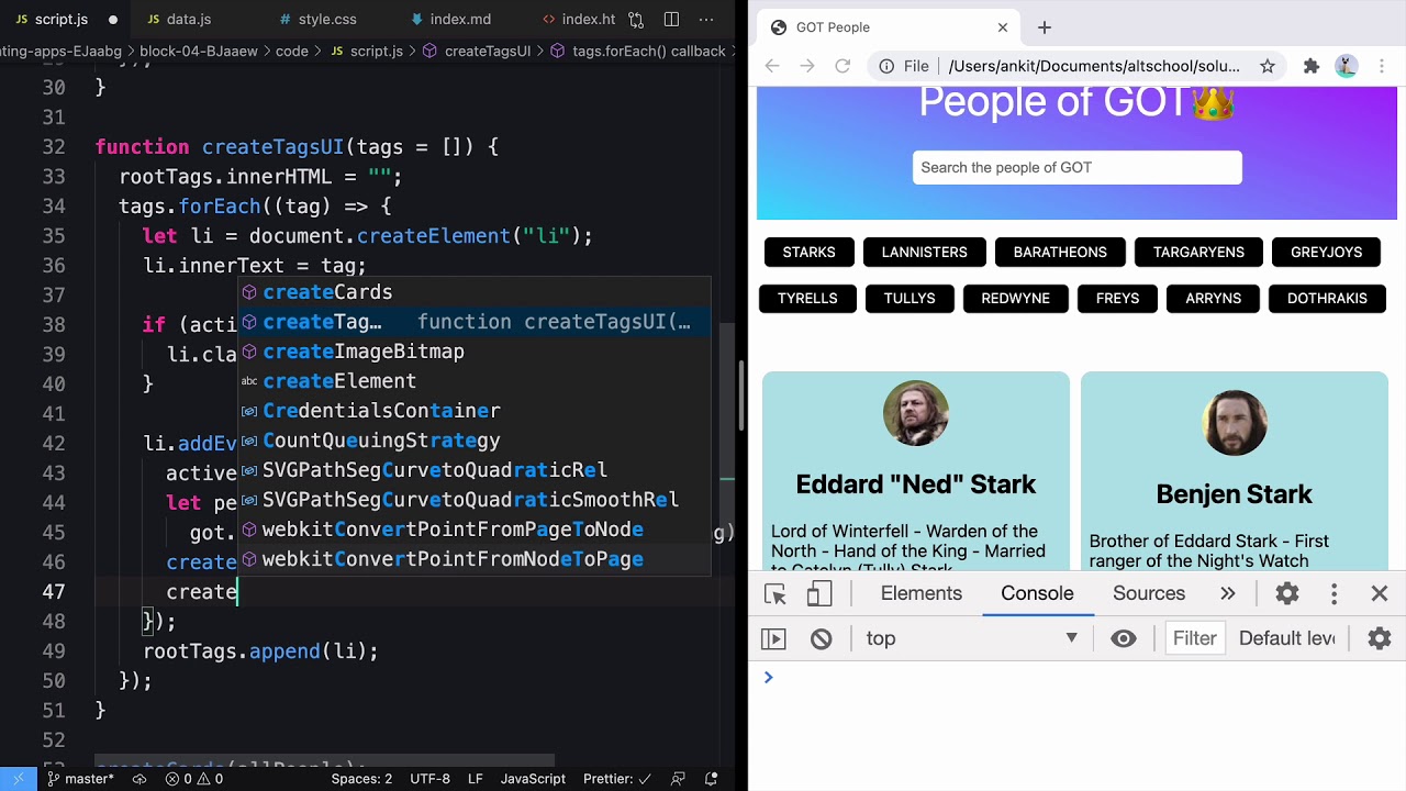
People of Game of Thrones using JavaScript DOM
AltCampus
296 views•2026-05-30

Introduction to Problem Solving Part - 1 | Lecture 1 | Intermediate DSA
ascensionix
107 views•2026-05-29

So What's Odin Lang Even Good For
TechOverTea
131 views•2026-06-01


