Astryx is a masterclass in decoupling component logic from aesthetics, offering a battle-tested architecture that scales far beyond simple UI kits. It effectively solves the long-standing trade-off between rigid design systems and unmaintainable custom forks.
Install our extension to search inside any video instantly.
Meta made their own shadcn (Astryx)
Added:This is Asterisk, Metaone version of Shaden, built on top of our styling solution, Starlex. It's fully themable, MIT licensed, and Meta says they've been refining this internally for eight years across 13,000 applications. If you're someone who dislikes Tailwind or Shadien, this one should definitely interest you. And even if you like Shadien, let's see if there's a reason to switch.
Now, I'm honestly really impressed with how many components and features that this launched with. It does go to show that they have been using this internally for years. There's over 150 accessible components built on top of React. But instead of going through this list, the best way to show you is probably with our templates as it shows all of them in use together. We have a group table here with status sections and drop-own menus. We have a payment form where you can see all of the individual form elements that you're going to need along with form status for things like error messages. You can build a drag and drop canban board with it or build out an IDE with tabs and sidebars. e-commerce sites, it has you handled there. And even an AI chat site, it can do that, too. Complete with a markdown component to render in the response that you get back. It also has a subscribe button. No, wait, that's YouTube. But go ahead and click subscribe if you like what we're doing here. It really helps out. As you can see, Aster should really have you covered for pretty much all of your component needs. And all of these components actually come from their core library. So using this is just the same as using any component would be. And you can check out the documentation for all of the options that a component has. For example, a button can have an icon. and it can have end content, sizes, varants, again, pretty much anything that you need. But now, let's get into why you should actually use this. Meta's argument is that design systems have always forced you into two bad options.
Option one is that you adopt a big company system like material UI and now all of your apps look like a Google product with limited customizability.
Option two is you grab something like Shadien. You copy and paste the components into your project, but you now own the code. So every project has its own fork of every component and upstream fixes become hard to follow because it's now your job to update all of these. Some people don't like being responsible for all of that component code. So Asterix claims to end that trade-off. With Asterisk, the system controls the behavior, accessibility, and quality, and themes control how it looks, being customized at the token level for things like color, type, radius, motion, everything you could need without ever rewriting a component.
So here I have an application that I made using some of those templates off the Asterisk website. And this is actually the default look of all of the components if you don't provide them with a theme. So it does come with a base theme. To create our own theme though, we can use the define theme function. And this actually comes with a couple cool features. The first one is the color option. Sometimes you know what your main brand color should be. In my case, it's a bright green. But you don't want to generate the background color, the accent color. You don't really want to think about all of those individual ones. So with asterisk here, if I just hit save on this, you can see it actually generates those for me. So I get a really good starting point just based off one hex color. After color, we then also have the typography options.
This is pretty self-explanatory. We're using in here, but then we do also have a scale. So, the base size for my text is going to be 14, but then it's going to have a ratio of 1.2. What this means is every step up we take in the text size. So, if I went for text size large, it's going to take the base and multiply it by 1.2, and that will be our individual text sizes. So, it's generating all of those tokens for us.
After this, we can then control the radius. This one is pretty self-explanatory. If I wanted our buttons to be rounded, I could set this to a high number. And if I wanted everything to have a sharp corner, I could set this to zero. After this, we then have the final helper option, which is motion. And this essentially just controls the animation speed for things like hovering and pressing. So you can get really far with the custom theme by just defining a few variables up here.
And that generates all of the tokens for you. But what if you don't like some of the tokens that it's selected? For example, if I wanted to change the color that it's chosen for my secondary button over here, we can go into the token section here. And a really cool thing about this theme and also this token section is that everything is type safe.
So it knows the tokens that we can actually define. And this is why it's better to do it in a JavaScript file or a TypeScript file instead of CSS since we can get that type safety. The background color of that secondary button is defined by the color neutral token. So all I need to do is set this to an array where one of them is light mode and the other is dark mode. For me, that's just going to be the same color.
If I hit save now, you can see it's changed the color of my secondary button. But we do have a problem where this text doesn't actually look right since I've now changed the color. So what I want to do is change that text color to black. But the problem is that is actually defined by the color text primary variable. So if I go ahead and save this, you can see it changes a load of the text on my screen to be black instead of just the one in the button like I wanted. So instead of changing that token globally, instead what I can do is just change it for the component.
This is where we can use the component section. I say we want to change our button here. I provide what the variant is in my case secondary. And I can put any CSS variables that I want in here.
So, I just want the color to be black.
So, now if I save this, we can see our secondary button has that black text color, but nothing else has changed now.
It's limited to just this component. The other cool thing about this component section is you can then also define your own custom variants. So, say I wanted a variant of a button called my button. I can set this up here with a color of black and a background color of red. And then when I go to use my button, it's all type safe and it knows that my button is a valid variant. You can see over here we now have a subscribe button. So, you can really do a lot just from that theme configuration, completely adjusting every part of each component or just the overall style of your app. And there's even some pre-built themes if you want to get started from a good base. You can see there's loads of customizations in these files. And you can even extend themes so you can build on top of an existing one instead of making a completely new one each time. All of these themes can then be built for production as well. So, it works in serverside rendered apps like Nex.js. It will statically generate all of the needed CSS and JavaScript. One of the great benefits of having a single place like this for your themes is that it helps enforce your brand consistency.
This is actually an argument I've seen against Tailwind where because a developer can write any class or an AI can write any, sometimes you end up with components that have a bit of a style drift since someone's decided to use their own Tailwind class. When you have a set theme like this, it's just easier to keep track of as it all happens in one place. You can easily differ if you want to see what's changed in your theme and an AI doesn't need to think about the Tailwind classes that it can use. It just uses the tokens and the components provided. Although I will say you can achieve something quite similar with Tailwind and Shadzen where you define everything as a token although it's not type- safe so it's going to be a lot harder to enforce. Now besides themes you can also just style a component directly if you want to make a change and there are actually a few ways to do this. The recommended way is probably using X style because that uses stylex X which this has been built on top of and meta obviously made. You can also use other libraries like Tailwind Panda and various things like that or just plain CSS with the class name. So you can see here I have overrides defined in stylex X. I've got some styles called a primary button where I want a color to be white and a background color to be red. If I now just want to change a single button on this page. All I need to do is give it the X style prop and pass it my style X styles. And if I hit save on this, you can see my primary button now adjusts to those styles. So, this is how you style something if you just want it to be one-off and you don't want to make this change for all of the primary buttons.
You can see on the documentation all of the different ways that you have to style a component. It is super flexible.
But the really cool one I want to point out is this Tailwind support. They've actually done this with what they call a Tailwind bridge. So, this lets you continue to use Tailwind, but it maps all of the design tokens from your theme that you set up in Asterisk to those Tailwind utility classes. So, things like your colors, radius, font size are all defined by the theme from asterisk, but then Tailwind can use those with the Tailwind class names. For me though, I'd probably continue to use stylex as it's what Asterisk has been built around. And I just think mixing those libraries is going to be more confusion than it's worth. Moving on from styling though, another great feature of asterisk is just how well it works with AI. There's actually an asterisk CLI, but it's largely not meant for human use, and it's actually meant for AI. It contains things like commands to fetch all of the documentation on each component, load it into context just to help your agents work with that component, and it can even fill your agents.mmd just to give some more guidance. I actually found when I was using this in all of my demos that it did an extremely good job of this, and I found the models like Fable, GPT, all of them could work with Asterisk, even though it's a relatively new library. Overall, you can see Asteris is just a seriously feature- packed design system. And I only went over the basics. I highly recommend checking out the documentation as it is really well written and most of these components even have best practice sections which is going to be really helpful for an LLM. And there's also a playground if you just want to try this without actually having a project. Would you use something like this? Let me know in the comments down below or there subscribe and as always see you in the next one.
Related Videos

6:13
Computer Science
TOP 15 Data compression Interview Questions and Answers 2019 Part-2 | Data compression | Wisdom jobs
wisdomjobs
281 views•2019-06-28

27:51
Computer Science
CTS 158: 802.11w Management Frame Protection
ClearToSend
4K views•2019-02-04
23:21
Computer Science
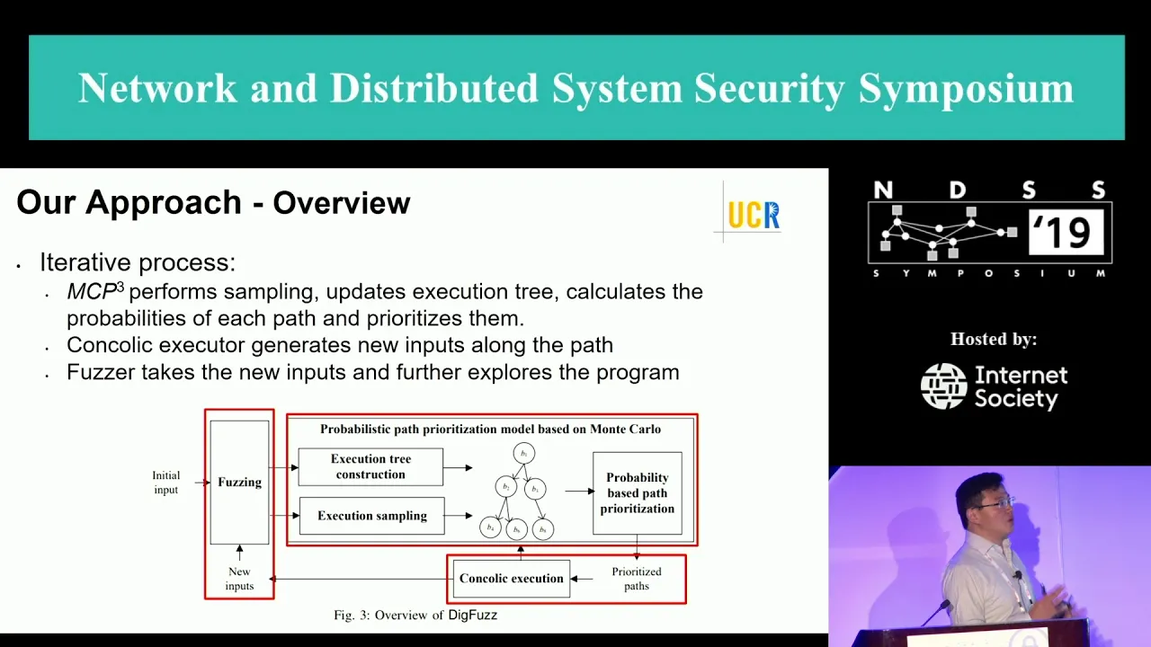
NDSS 2019 Send Hardest Problems My Way: Probabilistic Path Prioritization for Hybrid Fuzzing
NDSSSymposium
496 views•2019-04-02
12:48
Computer Science
How realistic is Cities: Skylines?
CityBeautiful
159K views•2019-02-14

46:39
Computer Science
GUIs & TUIs: Choosing a User Interface for Your Python Project | Real Python Podcast
realpython
2K views•2025-04-04

25:15
Computer Science
The OSI Model - Explained by Example
hnasr
225K views•2019-05-12

1:10:47
Computer Science
Cloud Computing - Introduction
elithecomputerguy
98K views•2019-10-07

2:24
Computer Science
From Traveler's Dilemma to Dynamic Routing | Demystifying Networking
IITBombayJuly
5K views•2019-08-04
Trending

13:38
Law
WOW! Judge TURNS THE TABLES on Trump in His OWN $10B LAWSUIT!!!
MeidasTouch
197K views•2026-07-23

13:25
Business
Playstation NO DISC/NO BUY Fight Is Over...
DavidJaffeGames
4K views•2026-07-23

22:40
Business
Steam and Xbox Just Dropped The Hammer On PlayStation
OhNoItsAlexx
9K views•2026-07-23

16:52
Anthropology
Americans Confused in Australia for 17 Minutes Straight
IWrocker
17K views•2026-07-23