This analysis masterfully connects complex atmospheric fluid dynamics with the alarming reality of record-breaking heat, making the abstract threat of climate change feel immediate and undeniable. It serves as a sobering reminder that our current weather patterns are rapidly entering a state where historical precedents no longer apply.
Installez notre extension pour rechercher instantanément dans n'importe quelle vidéo
Why The Heatwave Striking Both U.S. Coasts Right Now Has Forecasters On EdgeAjouté :
The last time Earth saw something like what the models are currently projecting, it triggered a famine that killed tens of millions of people, that was 1877. And right now, in early May, before summer has even started, both coasts of the United States are breaking simultaneous heat records that forecasters are calling structurally unprecedented. Phoenix at 110, Florida shattering 155 years of history, overnight lows that never drop below 80.
And this all of this is happening before the actual event has even begun. So the question I need you to sit with, the one driving everything in this video is this. If the pre-trigger looks like this, what does the main trigger look like? If two simultaneous heat domes in early May, already has you uneasy, hit like and subscribe to the Skyab because this story has barely introduced itself.
The subsurface heat is still rising. The models are still printing numbers nobody's printed before. And the gap between what the official forecasts are saying and what the atmosphere is already doing. Somebody needs to keep tracking that gap in real time. That's what we do here. You'll want to be watching when the next update lands.
Now, let's get into it.
Part one, the signal before the event. Here is something that should not be possible.
And yet, it is happening right now. At the exact same moment, two separate heat domes are cresting over two separate coastlines of the same country, thousands of miles apart, peaking within the same 24 to 48 hour window. And the forecasters watching this unfold are not yelling about it. They're getting very, very quiet. And if you have spent any time around scientists and meteorologists, you know that quiet is usually worse than yelling. Let's start with the numbers because the numbers are the first thing that tells you something is off. Out in the desert southwest, the Sultan Sea is forecast to hit 112° F.
Phoenix is on a trajectory that looks like a staircase going the wrong direction. 104°, then 108, then 110.
That is roughly 10° above what climatological normals say it should be for early May. Not late June, not the peak of August, early May. The season has not even shifted into summer mode yet and the desert is already behaving like the middle of July. Now, swing your attention to the other side of the country because that is what makes this particular event so unusual. While the Southwest is cooking under one pressure system, Florida is cooking under a completely different one. Jacksonville, a city that has been keeping continuous weather records for 155 years, is watching those records fall. Miami and Orlando are not far behind. South Florida is now staring down what the National Weather Service calls extreme heat risk, which is the top tier of their alert system. That classification is rare in any month. For early May, it is essentially unheard of. And here is the number that keeps showing up in the briefings and the bulletins and the quiet conversations among forecasters.
80°, that is the overnight low in some coastal areas of South Florida, 80°.
When the temperature drops from 100° to 80° overnight, that is not recovery.
That is a holding pattern. The human body, the power grid, the concrete and asphalt of every city in that region, none of them are getting the nighttime window they need to release the heat they absorb during the day. We will come back to what that means for the people living through it because it matters more than almost any other number in this entire story. Roughly 450,000 Californians are currently under extreme heat watches. That is not a rounding error. That is nearly half a million people being told officially that the heat coming at them falls outside the range of normal caution and into the range of genuine physiological danger.
And while all of that is happening on both coasts simultaneously, the same atmospheric pattern that is producing both heat domes is also generating eight active red flag warnings across the northern plains. conditions where a single spark becomes a catastrophe and a corridor of severe weather risk running across Oklahoma and northern Texas. One weather pattern, four distinct extreme hazards, two coasts. That is not a heat event. That is a systemwide stress test.
And it is happening right now in the first week of May. But here is what makes this more than just a remarkable weather week. This is happening. All of it simultaneously. In the same week that the Boston Globe ran a front page story warning that the strongest El Nino on record may be coming. In the same week that Time magazine raised the global implications. In the same week that the Weather Channel began using the phrase super El Nino in their framing. In the same week that the World Meteorological Organization issued a formal warning about rapid development in the Pacific, the National Oceanic and Atmospheric Administration, Noah, simultaneously raised its El Nino probability estimates. These institutional signals do not all move at the same time, unless something in the data is moving fast enough to make all of them move at once.
So, you have two heat domes on two coasts peaking in the same 48 hour window. You have half a million people under extreme heat alerts in California.
You have South Florida watching a 155-year record at risk. And you have the world's leading climate institutions simultaneously telling you that the most powerful El Nino ever recorded may be just getting started. These things are not unrelated. That is the story. That is the central question this video is going to spend the next 2 hours sitting inside of. Because here is the thing about heat domes. They are not rare. Any forecaster will tell you that heat domes form every year in different parts of the country and some of them are intense and some of them break records and most of them are regional. They sit over one area, they pump heat into one corridor, they dissipate. What is happening right now is different in a structural way that most weather coverage is not spending enough time explaining. What is happening right now is dual node activation. two separate ridges of high pressure separated by a continent sustained simultaneously under a single coherent atmospheric wave pattern. That is not twice the heat dome. That is something categorically different. The question the forecasters are quietly asking is not is this bad. They know it is bad. The question they are asking, not quite answering publicly yet, is whether this is an early expression of a system that is already behaving like it has entered peak phase. a system that according to some of the model outputs currently on their screens has never been forecast before in the modern era of operational meteorology. If the climate system is already producing this dual coastline heat domes early May preseason before El Nino is even formally declared then what exactly happens when the peak arrives? That is not a rhetorical question. It is the question that is keeping people who watch atmospheric systems for a living in a state of what I can only describe as calibrated alarm. Not panic, not drama. Calibrated alarm. The kind where you're very careful about what you say publicly because you're not entirely sure your models are working within a range they were built to handle. We are going to go through all of it. We going to look at why the atmosphere is configured the way it is right now. What the geometry of this particular pattern means for how long it persists. why the timing is the most important anomaly of everything you will hear today. What the Pacific Ocean is currently doing beneath the surface, what the model numbers actually say, and why some of them required the forecasters to literally expand the scale on their charts to fit the output and what the historical record does and does not tell us about what comes next. But before we get into the machinery of the atmosphere, I want to stay with the signal for just a moment longer. Because the signal is what started all of this. Two coasts, one week, same pattern before the season. That is the anomaly. Everything else we're about to discuss is the explanation for why that anomaly is not a coincidence and why the people who spend their careers tracking these patterns are watching this particular week with the kind of attention that they usually reserve for things that have already gone wrong. The atmosphere gave us a signal. The question is whether we are reading it correctly. And the fact that the forecasters are quiet rather than loud suggests that at least some of them are not entirely sure they are.
Part two, the geometry of the atmosphere.
To understand why two heat domes are cresting simultaneously on opposite coasts of the United States, you have to understand something about how the atmosphere is structured at high altitude. And specifically, you have to understand a configuration called an omega block. It sounds technical. It is not complicated, but it matters because it is the architecture that explains everything happening this week. Picture the upper atmosphere as a river. Not a narrow, orderly river, a wide meandering one, like the kind that snakes across a flood plane in long looping curves. That river is the jetream, and it governs where weather systems form, where they move, and how long they stay. Most of the time, that river flows in relatively smooth, broad curves across the continent. Weather systems form in it, travel with it, and move through. No single pattern dominates for too long.
The river keeps flowing. But sometimes that river gets pushed into a shape that looks from above like the Greek letter omega. A high ridge in the west, a deep trough in the center, another high ridge in the east. The flow locks into that shape and essentially stops moving the way it should. Weather systems that form under the ridges, heat domes in this case, do not travel through and dissipate. They sit, they build, and the longer they sit, the more heat accumulates beneath them. This is what is happening right now. And this is why meteorologists are paying close attention to the structure, not just the temperatures. The western ridge is what is cooking the southwest. It is anchored over the desert, which is already among the warmest terrain on the planet this time of year. The eastern ridge is what is cooking Florida. It is anchored over the Caribbean, pumping heat and moisture northward into a peninsula that is already subtropical. And in between those two ridges sits the trough, the central dip in the atmospheric river.
And that trough is what is generating the instability across the plains. The fire weather in the northern plains, the severe storm corridor across Oklahoma, all of that comes from the same wave.
The ridges produce the heat. The trough produces the volatility. One pattern, multiple outputs. Now, here is the critical detail that separates this event from a typical heat dome situation. These two ridges are not independent systems. They are not two separate weather events that happen to be occurring at the same time. They are nodes on the same Rosby wave train. And that distinction is everything. Rosby waves are large- scale oscillations in the atmosphere. They are the meanders in that river I described. They are named after KL Gustaf Rosby who described them in the 1930s and4s and they are the dominant structure governing weather patterns across entire continents. When a Rosby wave is in a low amplitude state, the jetream flows relatively straight and fast. Weather systems move through quickly and no single pattern persists for too long. When a Rosby wave is in a high amplitude state, the meanders become exaggerated. The ridges push farther north, the troughs dip farther south. The whole pattern slows down and individual weather systems can become essentially locked in place for days or even weeks. What we have right now is a high amplitude Rosby wave configuration. The wave is not just amplified. It is sustaining two ridge nodes simultaneously, one over the west and one over the east with the trough between them acting as the connector.
This is sometimes called a split ridge structure rather than a continental ridge. And it is notable because it means the heat is not concentrated in one location where it might at least be contained. It is distributed across the system in two separate but linked cores of extreme warmth. Under each of those ridges, something called subsidance is occurring, sinking air. When air sinks under a high pressure system, it compresses and when air compresses, it warms. This is basic atmospheric physics. The dry adobatic lapse rate tells us that descending air warms at roughly 5 1/2° F for every,000 ft it sinks. If you have air sinking from 30,000 ft down to the surface, you can do the math on how much warming occurs just from the descent alone before you even account for the solar radiation beating down on the surface beneath the clear skies that the ridge also produces. The ridge clears the clouds.
The clear skies let the sun in. The sun heats the ground. The ground heats the air from below. The sinking air heats it from above through compression. Both mechanisms working together is what produces the extreme temperatures. This is not unusual physics. Heat domes work this way every time. The atmospheric mechanism is well understood, well doumented, and completely predictable.
What is not usual is that this normal well understood physics is producing abnormal outcomes in two places at once in a month when it should not be producing them in either place with this intensity. The physics is familiar. The configuration, the timing, the scale, the dual node structure is what is unfamiliar. And that distinction goes directly back to the central question this entire video is built around. The climate system is already behaving like it is in peak phase before the event that would explain that behavior has formally begun. Now there is a research conversation happening in atmospheric science about whether these high amplitude wave configurations are becoming more common.
Some studies suggest that the jetream is becoming more meridian, more wavy with more pronounced ridges and troughs under global warming conditions. The idea is that as the Arctic warms faster than the tropics, the temperature difference that drives the jetream decreases and a weaker temperature gradient produces a slower, more meandering atmospheric river. This research is genuinely contested. There are scientists who find strong evidence for it in the observational record and scientists who argue the data is too noisy to draw firm conclusions. I want to be clear that this is not a settled question. But here is what is not contested. Right now in the first week of May, you have a high amplitude wave configuration sustaining two ridge nodes simultaneously.
Whether or not that configuration is becoming statistically more common is a research question. Whether or not it is happening right now is observational fact. And the observation is telling us something the research question will take years to definitively answer.
One more piece of the geometry deserves attention before we move on. And it connects this moment back to something that happened just weeks ago because this is not the first time in 2026 that forecasters have looked at the upper level pattern and seen something that gave them pause.
Back in March, a remarkably similar high amplitude ridge behavior produced one of the most extreme heat events of the entire century. More than 7,000 daily records broken. More than 2,000 monthly records, a national March temperature record of 112° F that placed that event among the most anomalous in modern meteorological history. That was 6 weeks ago. And now we are here again watching a similar wave structure produce a similar pattern of extreme ridge amplification, but this time across two nodes instead of one and in a month that is supposed to be quieter. two events six weeks apart, both driven by high amplitude ridge behavior, both exceeding what seasonal norms would predict. The geometry of the atmosphere is showing us something. And what it is showing us is that the system is already operating in a mode that resembles something far more energetically advanced than early May should look like. And the reason that matters, the reason it connects to everything the climate institutions were saying the same week about El Nino is that the atmospheric is not supposed to be responding this way yet. If it is already responding this way, then something in the underlying ocean conditions is already pushing it. What that something is and what the Pacific is doing beneath the surface right now is where we are headed next.
Part three, why timing is the red flag.
There is a concept in weather forecasting that does not get nearly enough attention outside of professional circles and it is called climatological normal. It sounds bureaucratic. It is actually fundamental.
A climatological normal is essentially what the atmosphere is supposed to be doing on any given date. The average temperature, the average pressure, the average frequency of specific weather patterns calculated over a 30-year baseline. It is the expectation against which any individual weather event is measured. And the way forecasters flag anomalies is by measuring how far a given observation departs from that expectation.
For early May in Phoenix, Arizona, the climatological normal for daily high temperatures sits somewhere in the low to mid90s.
110° F is not a slight departure from that. It is a departure of roughly 15 to 17° depending on the specific date. In statistical terms, that is an event several standard deviations outside the expected range. In practical terms, it means Phoenix is experiencing temperatures in the first week of May that would be considered extreme even in mid July. That is the timing anomaly.
And I want to argue that the timing anomaly is more significant in some ways than the temperatures themselves. Here is why.
The southwest's seasonal ridge, the persistent high-pressure system that typically dominates the region during summer and is responsible for the extreme heat that characterizes June, July, and August, is not fully established yet in early May. The atmospheric pattern that produces 110° days in Phoenix in late June exists because the seasonal configuration has evolved to support it over months of progressive warming. The soil is already hot. The regional moisture has been depleted. The atmospheric boundary layer has been conditioned to amplify heat. By late June, all of those preconditions are in place. In early May, they are not. And yet, here we are. The temperatures are arriving without the seasonal infrastructure to support them.
It is like a building that collapses not because the foundation is weak, but because the building was put under load before the foundation was ever poured.
The stress arrives before the system has had any chance to prepare for it.
Florida tells the same story from a different direction. The state's weather history is dominated by a pattern where extreme heat really begins to take hold in June and July when the combination of high sea surface temperatures, moisture laden air, and persistent high pressure produces the oppressive conditions that flidians know from experience.
The records being challenged right now at stations that have been measuring temperature for 155 continuous years are records that were set during those peak summer months and they are being challenged in early May. Now there is an important question to raise here and raise honestly. Are individual events meaningful as indicators of systemic change or are they just weather? This is where I want to be very careful about language. Any individual heat event, no matter how extreme, cannot by itself prove a trend. Weather is inherently variable. Outliers happen. Anomalous events always have occurred. A forecaster or a scientist who tells you that a single heatwave proves the climate is changing is overreaching, and you should be skeptical of them. But here is where the framing shifts from individual event to pattern. We're not talking about one anomalous event. We're talking about two anomalous events in 6 weeks. Both exceeding what the climatological baseline would predict.
Both occurring outside their expected seasonal window. Both driven by similar high amplitude ridge configurations. And we're talking about them occurring against a backdrop of multi-year data showing that early season extreme heat events have been appearing with increasing frequency in the recent observational record. One outlier is an outlier. Two outliers 6 weeks apart from the same season following a year of anomalous ocean heat in a week when every major climate institution is raising its El Nino probability estimates is a pattern that warrants serious attention. The forecasters's unease is not about the heat itself.
They have forecast extreme heat before.
It is about the calendar. The system is behaving like it is already months ahead of where it should be. These seasonal boundaries that give forecasters their conceptual framework for understanding what is normal in May versus what is normal in August are becoming less reliable. And when your baselines become less reliable, your ability to contextualize what you are seeing. And more importantly, what you should warn people about degrades. That is an operational problem, not just a scientific curiosity. Consider what it means for the extreme heat risk classification to be triggered in South Florida in early May. That classification exists at the top of a tiered alert system designed to communicate serious physiological danger to the public. It is calibrated against historical records of heat related illness and mortality. When it gets triggered in July, it is alarming. When it gets triggered in early May before the public, before health care systems, before infrastructure managers have mentally shifted into heat season mode, it creates a vulnerability that the temperature numbers alone do not capture. The danger is amplified by the timing, not just the intensity. And then there is something subtler happening that connects this timing anomaly directly back to the central question about where this system is heading. The reason the forecasters are quietly unnerved is not simply that the heat is early. It is that the heat is early and the ocean is already preconditioned.
When you see early season atmospheric extremes coinciding with subsurface Pacific Ocean heat that is the highest ever recorded for any April in the satellite era, you're not looking at two unrelated anomalies. You're potentially looking at a system in which the oceanic preconditioning is already beginning to influence the atmosphere in ways that should not be observable yet because the formal El Nino event those ocean conditions would produce has not even officially started. That is the red flag. Not the temperature, not the records, the timing. The atmosphere is responding to something and that something is happening ahead of schedule. The question of what a system behaving this way at this point in the calendar is going to do when the peak finally arrives is not an academic question. It is the question. But before we get to what the Pacific is doing and what the models are producing, there is one more dimension of the current event that deserves its own focused attention because it is the dimension that turns an extreme weather event into a genuine humanitarian crisis. The nights are not cooling down. And that is a problem that goes far beyond discomfort.
Part four, the night that doesn't cool.
The human body is a remarkably sophisticated thermal management system.
It sweats. It dilates blood vessels to bring heat to the surface. It breathes faster to exhaust heat through the lungs. It is under most conditions extraordinarily good at keeping its core temperature within the narrow band roughly 97 to 99° F that allows all its biochemistry to function correctly. But that system has one critical dependency that is often overlooked in discussions of heat waves. It needs time to recover.
During a heat wave, the body accumulates what physiologists sometimes call heat load. The net thermal stress imposed by the environment over the course of a day. Even if the body manages that stress successfully during the day, preventing core temperature from rising to dangerous levels, it does so at a cost. It depletes electrolytes. It strains the cardiovascular system. It redirects blood flow from the organs to the skin. It is working hard. And like any system working hard, it needs a recovery window. For the human body in a heat wave, that recovery window is the night. When overnight temperatures drop into the 60s or below, the body gets that recovery window. The thermal load from the environment decreases. Sweat dries efficiently. Core temperature drops naturally. The cardiovascular system returns to baseline. By morning, assuming the person slept, the body's reasonably prepared to face another hot day. When overnight temperatures stay in the upper 70s to low 80s, which is what is happening in South Florida right now, that recovery window does not exist. The body is never fully offloading the thermal stress from the previous day.
Each new day of heat is added on top of residual load from the day before. The accumulation is what kills people. Not any single moment of extreme heat, but the compound effect of heat stress that never fully resolves. Day two of a heat wave with warm nights is more dangerous than day two of a heat wave with cool nights, even if the daytime temperatures are identical.
The National Weather Service language for what South Florida is experiencing right now is precise and worth pausing on. Stagnant, soupy, uncomfortable.
Those are not dramatic words. They are accurate words. The ridge overhead suppresses wind. Low wind means the air near the surface is not being mixed or refreshed. Humidity already high because the Caribbean moisture source is directly feeding the region cannot evaporate efficiently from skin when the air is already saturated. High humidity, low wind, elevated overnight temperatures, and a ridge that shows no signs of breaking in the next several days.
That combination is not a forecast for discomfort. It is a forecast for a genuine physiological crisis, particularly for the elderly, for people without air conditioning, for outdoor workers who do not have the option of spending their day in a climate controlled environment. Let me give you the comparison that puts this into context. A typical early May night in Miami sees temperatures drop to somewhere in the upper 60s to low7s.
That is a 17 to 20° gap between daytime high and overnight low. You can feel that gap when you step outside after sunset. The air changes. There is a release. Right now, that gap is compressed to somewhere between 20 and 25° on a good night and in some coastal locations to as little as 12 to 15°.
Overnight lows above 80° in coastal South Florida in early May are not part of the climatological expectation for this time of year. They are in fact more characteristic of peak summer conditions. And this matters for something beyond individual health outcomes because cities are also thermal systems. the buildings, the roads, the concrete and asphalt that make up the urban fabric. All of that absorbs heat during the day and releases it overnight.
This is the urban heat island effect.
And it is amplified by the same conditions that are preventing human bodies from cooling. The stagnant air, the high humidity, the absence of wind to carry heat away from surfaces. When overnight temperatures stay elevated, the city never fully releases the heat it absorbed during the day. Each successive day it starts from a slightly higher baseline. The infrastructure of the city, the power grid serving air conditioning demand. The water systems trying to manage pressure is under continuous load rather than getting any recovery period. This is how a heat wave becomes a multi-day crisis rather than an acute event. It is not the peak temperature that stresses the grid to its limits. It is the sustained unrelenting demand from millions of air conditioners that never stop running because the nights never cool enough to allow people to open their windows. It is not the hottest afternoon that produces the most heat related emergency room visits. It is the third day of elevated overnight temperatures when the accumulated physiological debt becomes too much to manage. The heatwave's danger is in its persistence, not its peak. And right now in South Florida, the overnight temperatures are ensuring that this event persists rather than releases. There is a micro story here that I think captures the full picture more efficiently than any data point.
Cities do not fail in the heat. They fail to recover from it. The heat is the stressor. The nights without cooling are the mechanism of failure. And what is particularly significant about this moment is that the failure mode is occurring in early May before the public health infrastructure, before the utility companies, before the hospitals and the emergency management agencies have fully activated their summer heat protocols. The season has not shifted.
The system has not been warned and yet the conditions have arrived. Now all of that, the dual ridges, the timing, the overnight temperatures, the compound hazards is the symptom. To understand why the symptom is appearing now and what it means for what comes next, we have to go deeper than the atmosphere.
We have to go into the ocean.
Because what the Pacific is doing beneath the surface right now is the story underneath the story. And it is, if anything, more significant than anything we've discussed so far.
Part five, subsidance, compression, and energy stacking.
Before we go out to the Pacific, let us spend a few minutes making sure the physics of what is happening above the surface is completely clear because there is a tendency in weather coverage to describe heat domes in terms of temperature records and danger levels without spending much time explaining the actual mechanism. And the mechanism matters because it connects directly to why this event is as intense as it is.
The high pressure systems anchored over the southwest and the Caribbean are not producing heat from scratch. They are transforming energy that already exists in the atmosphere into heat through a process called adiabatic compression.
Air under a high pressure system is being continuously pushed downward subsidance. As that air sinks, the molecules within it are compressed into a smaller volume by the increasing atmospheric pressure closer to the surface. Compression generates heat.
This is the same physics that makes a bicycle pump warm when you use it. The energy is not created. It is converted from the kinetic energy of compression into thermal energy. The dry adiabatic lapse rate 5 1/2° Fahrenheit of warming for every thousand ft of descent is the quantity that captures this. Air sinking from 30,000 ft to the surface is warmed by roughly 165° F through compression alone before you even account for anything else. Of course that air starts cold at altitude. So the net effect is not that extreme in practice. But the compression contribution to surface temperatures under a heat dome is substantial. It is not all solar radiation. It is solar radiation plus compression working simultaneously. And then there is the clear sky factor. The ridge suppresses clouds. Clear skies mean the surface receives direct solar radiation without attenuation. That solar radiation heats the ground, desert ground in the case of the southwest, which has very low albido, and absorbs almost everything that hits it. The heated ground radiates longwave radiation upward into the air. The compressed sinking air is now being heated from below by the radiating ground at the same time it is being heated by compression from above. Both mechanisms are working simultaneously and they amplify each other. This is well understood physics. There is nothing mysterious about it. A heat dome forms, it produces these conditions and extreme temperatures result. Forecasters have been modeling this for decades.
What is not well understood, what is the actual scientific frontier right now is why this normal predictable set of physical processes is producing outcomes at this scale, at this time in this configuration. Normal physics, abnormal outcomes. That gap between what the mechanism predicts and what the observation reveals is where the central question lives. The mechanism tells you how. The timing and the scale tell you that something upstream of the mechanism in the ocean in the global climate system is already setting the table for a much larger feast than the season should currently be hosting. And that is precisely why the forecasters are quiet rather than routine. They understand the physics of what they are seeing. They do not yet fully understand why the system is expressing it this early.
Part six, one pattern for hazards.
Now, let me reframe what is happening this week because the way it is typically covered as a heatwave story is accurate but incomplete. What is actually happening as a compound hazard event and understanding it as a compound hazard event rather than a heatwave changes how you think about its significance and its risk. Go back to the atmospheric configuration we discussed. The omega block, the western ridge, the eastern ridge, the trough between them. Each component of that pattern is not just producing one type of extreme. It is producing multiple simultaneous extremes that overlap in both time and space. And each of those extremes is interacting with the others to produce systemic stress that no single hazard assessment captures on its own.
The western ridge is producing the southwest heat dome. 112° at the Sultan Sea. Phoenix on a trajectory toward 110.
450,000 Californians under extreme heat watches. That is hazard 1. It is also producing the conditions for fire weather across the region. The same subsidance that produces extreme heat also depletes atmospheric moisture, driving relative humidity into ranges that make any spark immediately dangerous. But the fire weather for this event is not primarily in the southwest.
It is in the northern plains where the interaction between the ridges and the trough is generating the atmospheric conditions that forecasters most fear when it comes to wildfire. Strong winds, very low relative humidity, and critically dry vegetation. The eight active red flag warnings across the northern plains are not separate from the heat dome event. They are produced by the same wave pattern through the mechanism of the trough between the ridges. That is hazard 2. The trough between the ridges is also doing something else. where a cold trough meets warm moist air being drawn northward from the Gulf of Mexico which the eastern ridge is helping to pump.
You get the ingredients for severe thunderstorms, atmospheric instability, moisture, windshare from the interaction of the two pressure systems. The result is the slight risk severe weather corridor across Oklahoma and northern Texas. That is hazard 3. And meanwhile, across the Gulf and up through the Florida peninsula, the eastern ridge is producing the sustained heat. the elevated overnight temperatures, the humidity, the physiological stress, the grid strain, the 155-year record challenges in Jacksonville. That is hazard 4. Four simultaneous extreme hazards from a single atmospheric configuration. And the operational challenge that creates is worth spending a moment on because it is not just a logistical problem. It is a resource allocation crisis.
Emergency management agencies do not have unlimited capacity. When you ask them to simultaneously manage a heat emergency across 450,000 people in California, a fire weather emergency across eight separate regions of the northern plains, a severe storm corridor across two states in the southern plains, and a heat health crisis across the entire Florida peninsula, with the same personnel, the same communication infrastructure, the same public attention budget, something gives.
Something gets less attention than it needs. The compound nature of the event is itself a risk factor independent of any individual hazard. And this is not the first time in recent years that a single synoptic pattern has produced this kind of multi-hazard output. This is part of what has some researchers paying attention to the question of atmospheric energy. The argument, and I want to flag this clearly as a research question rather than a settled conclusion, is that a more energetically charged atmosphere may amplify the extremes that each component of a given pattern can produce. More energy in the system means higher peaks in the ridges, lower troughs in the troughs, more moisture being advected, more windshare across boundaries.
The same synoptic configuration that in a lower energy regime would produce a moderate heat event and some thunderstorm activity might in a higher energy regime produce the configuration we are looking at right now. Think of it this way. Imagine a fire that has been burning steadily for hours. Throw more fuel on it and the same convective physics that was producing a moderate flame now produces a much larger one.
The physics of convection did not change. The energy input changed. The question some atmospheric scientists are beginning to ask carefully with appropriate uncertainty is whether the climate system is behaving like a fire that has been given more fuel, the same wave patterns, the same pressure configurations, the same physics but more extreme outputs because the underlying energy budget of the system has shifted. That is a speculative framing and I want to be honest about that. But it is framing that the current event makes difficult to dismiss precisely because the event is occurring before the El Nino that would supply the energy increase has even formally started. If this is what prepak looks like and the system is already producing four simultaneous extreme hazards across the continental United States in the first week of May, then the question of what happens when the peak actually arrives is not rhetorical. It is operational. Emergency managers need to be asking it. Utility companies need to be asking it and they probably are quietly in the same way the forecasters are quietly watching the model outputs without quite being ready to say publicly what those outputs are showing them.
Part seven. The March event was not isolated.
Before we go out to the Pacific and look at what the ocean is doing, we need to pause on something that got significant coverage in March of 2026 and then largely faded from public attention in the way that most weather events do once they are over. Because it turns out March was not isolated. And if you look at both events together, March and now, a pattern emerges that changes how you have to interpret what you're currently watching. In March 2026, a heat dome event moved across the United States that shattered records with a completeness that stunned professional meteorologists.
More than 7,000 daily temperature records were broken. More than 2,000 monthly records fell. The national March temperature record reached 112° F, a number that when it was recorded, meteorologists described as belonging to a different month entirely.
In terms of its deviation from climatological expectations, that event was classified among the most extreme heat events in the entire century of modern meteorological observation.
The atmospheric mechanism behind the March event had some specific features that differentiated it somewhat from what we're seeing right now.
There was a connection to a Kona storm, a type of upper level low that forms near Hawaii and can alter the jetream pattern over North America in ways that are not fully predictable at longer times. That Kona influence contributed to the ridge amplification that produced the extreme heat. Forecasters noted this and some pointed to it as a partial explanation for why the event was so difficult to anticipate at longer ranges. The specific combination of factors was unusual enough to seem at the time like a singular confluence, a rare alignment that produced an extraordinary but ultimately isolated event. Except it was not isolated.
6 weeks later, in the first week of May, a structurally similar high amplitude ridge configuration is producing the event we are currently watching. Except this time, the configuration has two nodes instead of one. It is occurring on both coasts simultaneously and it is producing a compound multi-hazard response rather than a concentrated regional one. The March event was intense. The current event is broader and the question that follows immediately from putting those two events side by side is not a comfortable one. What is the statistical probability of two events of this magnitude occurring within 6 weeks of each other in the same season? In a climate system operating within its historical range of variability, the answer is very low.
These are the kinds of events that historically have return periods measured in decades or longer. Two of them in 6 weeks in the same season from similar atmospheric configurations would represent a statistical anomaly significant enough to suggest that the climate system is not operating within its historical range of variability.
That is not a political statement. it is a probabilistic one. Now I want to be clear about what this does and does not mean. It does not mean that any individual event can be definitively attributed to a specific cause.
Attribution science is sophisticated and careful and does not work by pointing at a single event and declaring a verdict.
What it does mean is that two 500year class events in 6 weeks in the same season is a signal that warrants serious attention from researchers and policy makers alike.
And what makes it particularly relevant to the central question of this video is that both events March and now are occurring against the same backdrop. a Pacific Ocean that is warming unusually rapidly with subsurface heat at levels that have never been recorded for this time of year in the satellite era at a moment when the world's climate institutions are simultaneously raising their probability estimates for what could be the most powerful El Nino ever recorded. The March event was the first signal. The current event is the second signal. And both of them are arriving before the phenomenon that might explain them, the El Nino, has even formally started. That sequencing is the alarm.
The climate system is already expressing something in the atmosphere that is consistent with a system that is further along in its transition than the official monitoring indicators suggest.
If the atmosphere is responding to the Pacific Ocean's developing conditions before those conditions have crossed the formal thresholds we use to declare an El Nino event, it means our monitoring framework may be telling us what phase we're in, while the atmosphere is already behaving like a different phase entirely. That mismatch is exactly what has the forecasters quietly unsettled and it is exactly what takes us to the Pacific.
Part 8. The Pacific is already moving.
There is a region of the tropical Pacific Ocean roughly centered between 170° west and 120° west straddling the equator. It is called the Nino 3.4 region. If you drew it on a map, it would look like a rectangular patch of deep blue water sitting in the middle of the world's largest ocean. Seemingly unremarkable from the surface. But this particular patch of ocean is for practical purposes one of the most important pieces of geography on Earth.
Because the temperature of the water in this region drives atmospheric circulation patterns that determine rainfall, drought, temperature, and storm activity across virtually every inhabited region of the planet. When the water there is warmer than average, the atmosphere responds with a set of global weather pattern shifts we call El Nino.
When it is cooler than average, the opposite pattern, Leninia, takes hold.
For the past several years, the Pacific has been in a Leninia dominated state.
That means cooler than average water in the Nino 3.4 region and the global pattern that goes with it. enhanced rainfall in the western Pacific and Australia. Suppressed rainfall in the eastern Pacific and the Americas, modified storm tracks across North America. Leninia has been the baseline condition against which weather events in the United States have been occurring for long enough that it has become normalized in the operational and public forecasting framework. that is changing and the rate at which it is changing is what has the modeling community producing outputs that are simultaneously their most sophisticated and their most uncertain.
Starting roughly 6 months ago, the surface temperature of the Nino 3.4 region began warming. That warming as of the most recent monitoring data amounts to approximately 66° C above the long-term average. That number alone would be notable. It represents a clear departure from the Laninia baseline and puts the region in what forecasters call Enso neutral territory trending toward El Nino.
But the surface temperature is not the most significant number in the current data. The most significant number is beneath the surface. Subsurface ocean heat content, the thermal energy stored in the layers of the ocean between 0 and 300 m depth, is currently at the highest level ever recorded for any April in the satellite observational record.
The satellite era of ocean monitoring covers roughly 40 to 50 years of continuous data depending on the measurement system. In that entire record, the ocean has never had this much stored heat in April. Not during the buildup to the 1997 to 1998 El Nino, which was at that time the strongest on record. Not during the 2015 to 2016 El Nino, which approached or exceeded it at peak. not during any of the dozens of other Enzo events that have occurred in the satellite era. This April is unprecedented in subsurface ocean heat content. The distinction between subsurface heat and surface temperature is critical to understand and it is worth taking a moment with a metaphor.
Imagine a pot of water on a stove. The subsurface heat content is the heat that has already been absorbed by the water but has not yet reached the surface. The pot is heating from the bottom up and the surface temperature has not yet fully reflected how much energy is stored in the water below. When you watch the surface temperature of that pot, you are not seeing the total energy of the system. You are seeing the most recent layer. The energy beneath the surface is the freight train coming before you can hear it. In oceanographic terms, the subsurface heat in the Pacific is the precursor to surface warming. The warm water below is going to come up. upwelling, mixing, trade wind changes. All of these mechanisms will eventually bring that subsurface heat to the surface. And when it arrives, it will drive the surface temperature of the Nino 3.4 region upward in ways that the current readings do not yet fully capture. The models can see this coming. They can see the subsurface heat reservoir. They can model within a range of uncertainty how that heat will translate to surface conditions over the coming months. and what they are producing. The numbers that some operational forecasting systems literally had to expand their graphical scales to display is what we are going to look at in the next section. But first, let us connect this ocean picture back to what we are watching in the atmosphere right now.
Because one of the most scientifically interesting and contested aspects of Enzo development is the question of how and when the atmosphere begins responding to ocean conditions. In a typical El Nino development scenario, the atmosphere responds to ocean warming after that warming crosses certain surface temperature thresholds. The tropical heating drives convection which alters the walker circulation which reorganizes the jetream which eventually changes weather patterns across the globe. This is a sequential timelagged process. Ocean changes then atmosphere changes. That is the standard model.
What some researchers are now examining with significant caution is whether the current atmospheric behavior, the high amplitude wave patterns, the early season heat extremes, the dual ridge configuration might already be a partial atmospheric response to the subsurface ocean conditions before those conditions have fully expressed at the surface. If the atmosphere is already responding to ocean conditions that the surface temperature record has not yet fully reflected, then the standard model of Enzo development may underestimate how quickly and how forcefully the atmospheric response can begin. It would mean that by the time the surface temperatures fully catch up to the subsurface heat, the atmospheric pattern is already ahead of the ocean, primed, configured, and ready to amplify whatever the ocean delivers. That is a speculative interpretation of current observations. I want to be clear about that, but it is a scientifically serious one. And it is precisely the kind of interpretation that makes the timing of the current heat event, dual coasts, early May, pre- peak, so significant.
The atmosphere may be responding to a signal that the standard surface measurements are not yet fully showing.
If that is what is happening, then the current event is not just an anomaly. It is a preview.
Part nine, numbers that broke the scale.
There are moments in science when the data being generated is not just significant, it is genuinely unprecedented. When the numbers being produced by your best models are numbers your best models have never produced before. When the graphics team has to call the programmers because the graph that has displayed model output for 20 years needs to be redrawn to fit what the models are currently saying. That is the situation in which some of the world's leading ENSO forecasting teams currently find themselves. Let me give you the context before I give you the numbers. The two strongest El Nino events in the modern observational record are the 1997 to 1998 event and the 2015 to 2016 event. At their respective peaks, those events produced anomalies in the Nino 3.4 sea surface temperature index of approximately 2.4° C and 2.6° 6° C above the long-term average. These are extraordinary departures from normal. They produce global weather disruptions that are still referenced as benchmarks in impact assessments. The floods, the droughts, the altered storm tracks, the agricultural losses, the disease outbreaks that followed. These are the reference points against which any new El Nino is measured. The multimodel ensemble median for the current ENSO development is currently projecting a peak anomaly of approximately 2.9° C.
Let that number sit for a moment. 2.9° that is.3° above the 2015 to 2016 event.
That is half a degree above the 1997 to 1998 event. In ENSO terms, those are not marginal differences. They are substantial ones. The relationship between Enzo magnitude and global weather impacts is not linear. It is approximately exponential. A 2.9° event is not a little stronger than a 2.6° event. It is considerably stronger in terms of its ability to disrupt precipitation patterns, alter storm tracks, drive drought and flood in specific regions, and modify temperature baselines across large parts of the planet. And 2.9 is the median. models are producing outputs that extend beyond 3° C. Some ensemble members are showing peak anomalies in the range of 3.5° or higher. The upper tail of the probability distribution for this ENSO event extends into territory that has never been occupied in the observational record. There is no historical benchmark for a 3.5° Nino 3.4 anomaly. There is no reference event you can point to and say this is what a world experiencing that looks like. Climate scientists and meteorologists are in the genuinely uncomfortable position of forecasting consequences for an event that has no historical parallel in modern monitoring. That is why the forecasting systems had to expand their graphical scales. The yaxis on the standard Enzo forecast plume graphics, the chart that shows model output for Nino 3.4 anomaly over time was simply not designed to display values above 3.0°.
the operational systems that generate those charts had to be modified to display what the models are producing.
When your visualization tools need to be updated to fit your model output, you're in unprecedented territory. That is not alarmism. That is a description of what actually happened in operational forecasting centers. Now, there are important caveats to apply to these numbers and we will get to them in the next section because there is a genuine scientific debate about how to interpret these outputs. But before we get to the debate, I want to make sure the scale of what the models are showing is clear.
The median projection for this El Nino is stronger than any El Nino ever recorded in modern history. The upper tail of the distribution extends into territory for which there is no observational benchmark. And all of this is being projected for late 2026, a peak that is still months away from a system that is already driving dual coast heat domes in early May before that peak has arrived. The institutional response to these numbers has been significant. The World Meteorological Organization issued the rapid development warning we mentioned in the opening section. Noise's climate prediction center raised its El Nino probability estimates. The Boston Globe, Time, the Weather Channel, all running the El Nino story in the same week that the atmospheric expression of the developing event was breaking 155-year records in Florida. The convergence of those signals, institutional, media, observational in the same week is not coincidental. It reflects the fact that the data driving those institutional responses is the same data producing the atmospheric conditions currently visible in real time. The models are telling a story. The atmosphere right now this week is showing you the first chapter of that story. The question is what the later chapters look like and whether the framework we use to forecast them is adequate to the magnitude of what the models are suggesting.
Part 10, definitive versus premature.
Whenever scientific data pushes into genuinely unprecedented territory, the scientific community does what it is supposed to do. It debates. And the current El Nino forecast is producing a genuine substantive debate among serious researchers and operational forecasters.
Not about whether warming is occurring, not about the direction of the trend, but about how far beyond the historical record this event will actually reach, and whether the current model outputs should be treated as reliable guides to action or as uncertain extrapolations beyond validated ranges. Let me describe the two camps as fairly and accurately as I can because this debate matters for how policymakers, emergency managers, and the general public should think about the coming months. The high confidence camp looks at the subsurface ocean heat content, record high for any April in the satellite era, and the rate of warming over the past 6 months, and concludes that the trajectory toward an extremely powerful El Nino is already essentially locked in. The heat reservoir in the Pacific is so large and the physical mechanisms by which it will translate to surface warming are so well understood that the outcome is in their view highly probable regardless of how atmospheric conditions evolve from here.
This camp tends to use language like definitive and inevitable and to reference the unprecedented subsurface heat as the primary evidence. They look at the March heat event, the current dual coast event and the model outputs together and see a coherent picture of a system already an advanced transition.
The cautious camp is not disputing the physics or the observations. They are raising methodological concerns about what happens when you ask models to forecast outside their validated range.
Every numerical model, atmospheric or oceanic, is calibrated and tested against historical data. When the phenomenon being forecast exceeds the historical range against which the model was validated, the model is being asked to extrapolate rather than interpolate.
Extrapolation introduces uncertainty that is fundamentally different from the uncertainty that exists within the model's validated range. The cautious camp argues that projecting El Nino peak anomalies of 3° or higher involves significant extrapolation uncertainty and that presenting those projections with the same confidence level as projections within the historical range is epistemically overconfident. They call the most extreme projections premature. Not wrong necessarily, but not yet established with sufficient rigor to justify high confidence. Both positions are scientifically legitimate.
The disagreement is not about ideology or politics. It is about how to handle uncertainty at the boundaries of a model's validated performance range. And this is actually a healthy debate because it reflects the genuine epistemological challenge of forecasting at extremes. But here is where the debate becomes directly relevant to the current heat event and to the central question driving this entire video. The dual coast heat domes happening right now are occurring in the gap between these two positions. They are consistent with what the high confidence camp would predict from a system already in advanced El Nino development. They are more extreme than what the cautious camp would expect from a system that has not yet formally crossed the El Nino threshold. The atmosphere right now in early May is already producing weather that falls on the wrong side of the premature argument. The heat is not waiting for the scientific debate to resolve. The records are being broken whether or not the forecasters have settled on the magnitude of what is causing them. And that perhaps is the most clarifying lens through which to view this week's events. The debate between definitive and premature is a debate about what the numbers will look like at peak. The atmosphere is already providing observational evidence that contributes to that debate.
Every record broken in Jacksonville, every overnight low above 80° in Miami, every afternoon in Phoenix that climbs toward 110, all of it is data. And the data is currently trending in a direction that the high confidence camp will site as vindication. While the cautious camp will note that individual events, however extreme, cannot resolve distributional forecasting questions.
Both camps are right to hold their positions for the reasons they hold them, and both camps are watching this week very carefully.
Part 11, the 1877 analog returns.
When forecasters and climate scientists try to understand what an El Nino of potentially record magnitude would look like in terms of global impacts, they face a fundamental problem. There is no modern analog to consult. The historical record in the satellite era and in the instrumental record going back to the late 19th century simply does not contain an event of the magnitude some models are now projecting. So researchers have gone back further. They have gone to the paleocclimate record and the only event that begins to resemble the magnitude of what the current models are suggesting is something that occurred in 1876 to 1878.
that El Nino, which climatologists have reconstructed from historical records, tree rings, coral archives, and documentary evidence, was of a magnitude that the current scientific literature estimates may have exceeded anything in the subsequent century and a half of the instrumental record. Its impacts were global and catastrophic.
The drought it triggered in South Asia contributed to a famine that caused the deaths of tens of millions of people.
China experienced its own devastating drought and agricultural collapse. East Africa, Brazil, Australia, all were affected by the disruption to global rainfall and temperature patterns that the event produced. It was in historical terms one of the most consequential weather events in recorded history. Now, I want to be very careful about how this analog presented because it is easy to draw the wrong conclusions from it and I do not want to do that.
The 1876 to 1878 El Nino is not a direct prediction of what the current event will produce. The climate system of the 1870s was different from the climate system of the 2020s in multiple important ways. Global mean temperatures were roughly 1 1/2° C cooler than today.
The distribution of warm and cool ocean waters was different. The background atmospheric CO2 concentration was pre-industrial. The population distribution and agricultural systems that were affected by the drought were fundamentally different from those of the modern world. What the analog does provide is a sense of atmospheric and oceanic magnitude. A data point that says this is roughly what a very powerful El Nino looks like in terms of Nino 3.4 anomaly and duration. It does not tell you where the impacts will fall in the modern world or with what severity because the baseline climate onto which the El Nino signal is superimposed is so different from the modern one. And that brings up the question that the analog most usefully raises, which is this. What happens when you superimpose an El Nino signal of historical magnitude onto a baseline climate that is already warmer than it has been in thousands of years? The El Nino itself adds anomalous warming on top of whatever the background temperature already is. If the background temperature is higher than it was in 1877 and it is by more than 1° C globally, then the absolute temperatures produced by an equivalent El Nino signal will be higher than those of the 1877 event, even if the El Nino signal itself is of the same magnitude. This is the amplification question. The analog tells you what the signal looks like. The current baseline tells you that the same signal superimposed on today's climate produces higher absolute values. How much higher and what the threshold effects of those higher values are for specific impacts agricultural, hydraological, health related is exactly what the research community is currently trying to work out under conditions of significant uncertainty using models that are being pushed beyond their validated range. That is not a comfortable place to be doing science, but it is where the data has taken us.
And the dual coast heat domes of early May are in a very real sense a small preview of the question the 1877 analog is asking. What does this magnitude on this baseline actually look like when it arrives?
Part 12. Geoengineering claims.
Anytime there is an extreme weather event of this magnitude, particularly one that has a clear visual and experiential impact on large numbers of people, theories emerge about alternative causes. And one that has gained significant traction in social media discussions around this event is the claim that the dual heat dome is the result of geoengineering, some form of deliberate atmospheric intervention by governments or institutions capable of manipulating weather at continental scale. I want to address this directly and calmly because it deserves a clear response rather than dismissal.
The claim in its most common form is that cloud seeding, chemtrail dispersal or other atmospheric interventions are responsible for producing or amplifying the current heat event. Here is the relevant physics. A heat dome of the scale currently observed covering the entire southwest and the entire Florida peninsula and the Caribbean simultaneously represents an energy budget of genuinely astronomical proportions. The amount of thermal energy involved in maintaining high pressure systems of this size and intensity for multiple days is on the order of pigles to exogles that is quadrillions to quintilions of jewels of energy. The totality of human energy production on Earth, all fossil fuels, all nuclear, all renewables, everything is approximately 600 exjoules per year.
The energy budget of a continental scale atmospheric pattern is not something that any current human technology or any technology on the foreseeable horizon could produce, sustain or control.
Cloud seeding exists and is real. It can, under specific conditions, influence local precipitation by introducing condensation nuclei into clouds that are already nearly saturated. Its effects are local, measured in tens of kilome at most, and depend entirely on pre-existing atmospheric conditions that the seeding cannot create. It cannot create a heat dome. It cannot maintain high pressure over a continent. It cannot produce a rosby wave configuration. The energy scales are mismatched by many orders of magnitude. The current heat event is fully explained by the atmospheric dynamics we have described. The omega block, the high amplitude Rosby wave, the subsurface ocean heat, the Enzo transition.
These are large-scale climate system forces that operate on energy budgets no human institution currently influences.
That is not an exoneration of human activity. Human activity has very much contributed to the background warming conditions that amplify these events.
But the mechanism is greenhouse gas emissions modifying the global energy balance over decades, not active real-time atmospheric manipulation.
The distinction matters for how we understand both the event and what to do about it. Part 13, solar and external drivers.
Another alternative explanation circulating in relation to this event involves solar activity. The argument is that we are currently in an active phase of the solar cycle and that increased solar output is responsible for the warming being observed. This is a reasonable hypothesis to examine and solar forcing is a legitimate area of climate science. Let us look at what the observations actually show. We are indeed currently in solar cycle 25 which has been notably active, more active than many forecasters predicted at the beginning of the cycle. Solar maximum for this cycle is occurring roughly now and the sunspot counts and solar irradiance measurements have been elevated compared to the preceding cycles. Solar flares and coronal mass ejections have been more frequent. The sun is by any objective measure currently in an energetic phase.
However, when you look at the relationship between solar activity and Earth's surface temperature, several important observations emerge. First, the increase in total solar irradiance between solar minimum and solar maximum is very small in relative terms, approximately.1%.
The absolute energy difference between a solar minimum and a solar maximum arriving at Earth's atmosphere is not sufficient to drive the temperature anomalies we are currently observing.
Climate models that include solar forcing as a variable can distinguish the signal of solar variability from other drivers and the current period of solar activity is within historical ranges of variability. It is an active cycle but not anomalously outside the range of previous cycles. Second, and critically, the observational temperature record does not show the patterns you would expect if solar activity were the primary driver of current warming trends. Solardriven warming would be relatively uniform across the atmosphere. You would expect the upper atmosphere to warm at a similar rate to the lower atmosphere or potentially faster. What we actually observe is cooling in the upper atmosphere and warming concentrated in the lower troposphere, which is precisely the pattern predicted by greenhouse gas forcing rather than solar forcing. The observational fingerprint of the current warming is inconsistent with solar forcing being the primary driver. The current heat event is occurring at a time of active solar activity. But the solar activity is not the mechanism producing it. The mechanism is the one we have spent the last several sections describing. Large scale climate system dynamics, the Enzo transition, the high amplitude wave patterns and the elevated baseline from which all of these are occurring. The solar cycle is real and worth monitoring, but it is not the explanation for what you're watching unfold across both coastlines this week.
Part 14. It's just cyclical.
The third alternative framing I want to address is the historical comparison argument. The claim that events like this have happened before, that the 1930s produced comparable heat extremes in the United States, and that the current heat domes are simply the latest expression of natural climate variability that has always existed and always will. This framing contains a real truth and a misleading conclusion.
The real truth is that the 1930s did produce extraordinary heat events in the United States. The Dust Bowl era heat waves, particularly those of 1934 and 1936, produced temperatures across the Great Plains and Midwest that remain records at some stations to this day.
Those events were devastating. They drove migration, destroyed agriculture, and contributed to the economic collapse of an already depressionstricken nation.
Natural climate variability is real, substantial, and capable of producing extreme events that rival anything in the modern record. This is not in dispute. The misleading conclusion is that the current heat event is therefore comparable to those events and requires no explanation beyond natural variability.
Several critical differences between the 1930s and today make this equivalence problematic. First, the global mean temperature baseline is roughly 1° C warmer today than in the 1930s, and ocean temperatures are substantially warmer. The oceanic conditions that contributed to the dust bowl heat were driven in part by cold Pacific SSTs that enhanced the drought pattern. The current conditions feature warm Pacific SSTs in the process of becoming much warmer. Second, the subsurface ocean heat content record, which the 1930s obviously do not have, is showing unprecedented levels that have no 19th or early 20th century parallel in the instrumental record. Third, the atmospheric patterns are different. The dust bowl heat was primarily continental and driven by soil moisture feedbacks from the drought itself, not by the kind of large-scale Rosby wave amplification we are currently observing with two simultaneous ridge nodes on opposite coasts. Natural variability is real.
Historical precedent is valuable. But the conditions underlying the current event, the ocean heat, the atmospheric configuration, the ENO transition, the timing are not replications of past cycles. They are occurring on a different baseline in a different oceanic context and producing spatial patterns that are structurally different from the historical analog events. The climate system has cycles, but cycles do not always repeat in the same range. And when the background conditions from which a cycle begins are different from any previous starting point, the cycle itself operates differently. The 1930s were extreme. What is happening now is different in ways that matter for how we understand the risk going forward.
Part 15. Pre-trigger heat. Let us step back now. Let us pull the camera all the way out and look at the full picture that has assembled over the course of this video. Because I think when you put all the pieces together in one place, side by side, the significance of this particular week becomes clearer than any individual data point can convey on its own. And I want you to feel the weight of that full picture, not just the individual numbers. Because the individual numbers are alarming enough, but the pattern they form when you line them up is something else entirely. In the first week of May 2026, you have dual heat domes. Two separate ridge systems on two separate coastlines peaking inside the same 48 hour window.
The western ridge is producing temperatures in Phoenix that belong to mid July. Not late June, not the first week of June, mid July. The Eastern Ridge is anchored over the Caribbean and pumping heat northward into the Florida Peninsula. challenging records at weather stations that have been keeping continuous, unbroken records for 155 years. South Florida is sitting under the highest tier of the National Weather Service heat alert system, extreme heat risk. With overnight lows that are not dropping below 80°, think about what that means for a moment. 80° at 3:00 in the morning, the air is not cooling. The city is not cooling. The human body sitting in that air is not recovering.
450,000 Californians are simultaneously under extreme heat watches on the other side of the continent. Eight red flag warnings are active across the northern plains. A severe weather corridor is carving through Oklahoma. One atmospheric pattern, four simultaneous extreme hazards, two coasts. That alone would be a significant weather week. But here is where the framing has to shift.
Because what makes this week more than a significant weather week is not the temperature numbers, as extreme as they are. It is the timing. It is the calendar. It is the fact that all of this, all of it is occurring before the season has shifted. Early May is a transitional month. It is the shoulder between spring and summer. The atmospheric infrastructure that produces genuine July level heat, the conditioned boundary layer, the depleted soil moisture, the fully established seasonal ridge. None of that is supposed to be in place yet. And yet, here we are. The heat is arriving without the seasonal preparation to receive it. The stress is landing on a system that has not been warned. This is what it means when forecasters use the phrase acting out of sequence. The seasonal boundaries that give operational meteorology its conceptual framework, the understanding of what is normal in May versus what is normal in August are being violated. Not nudged, not slightly exceeded, violated.
The climatological normals are being surpassed not marginally but substantially in patterns that do not resemble pre-season spring. They resemble peak summer. And that distinction is the central anomaly of this entire event. Now pan out further because the atmosphere does not exist in isolation. It sits on top of an ocean.
And right now that ocean is doing something that has never been recorded before. The Pacific Ocean currently holds more subsurface heat. thermal energy stored in the layers between 0 and 300 m depth than it has held in any April in the entire satellite monitoring record. Let that sit for a moment. The satellite era covers roughly 40 to 50 years of continuous ocean observation.
That is the full span of modern oceanographic monitoring. And in that entire record, the Pacific has never been this warm beneath the surface at this time of year. Not during the buildup to the 1997 to 1998 El Nino, which was until recently the benchmark for what a powerful ENSO event looks like. Not during the 2015 to 2016 event, not during any of the dozens of other cycles that have occurred within the monitoring period. This April is unprecedented. That word gets overused.
In this case, it is the precise and correct word. And here is what that subsurface heat is doing to the forecast models. The Nino 3.4 region, the patch of equatorial Pacific Ocean that effectively governs global weather patterns when it warms or cools, is warming at a rate that the multimodel ensemble median now projects will produce a peak anomaly exceeding 2.9° C above the long-term average. The two strongest El Nino events in the modern observational record peaked at approximately 2.4 and 2.6° respectively.
2.9 is not a small increment above those numbers. In a system where impacts scale nonlinearly with magnitude, 2.9 is substantially more powerful than 2.6 in terms of what it does to global circulation patterns, precipitation, drought, storm tracks, and temperature baselines across the planet. And some ensemble members are not stopping at 2.9. Some are showing peak anomalies above 3° C. The upper tail of the probability distribution extends into territory that has no observational benchmark in the modern era. No reference event, no historical analog in the instrumental record. The only event with even vaguely comparable magnitude is the 1876 to 1878 El Nino. And the reason that name matters, the reason researchers keep coming back to it is what it did. The famine it triggered in South Asia killed tens of millions of people. China collapsed into agricultural crisis. East Africa, Brazil, Australia, all disrupted by the reorganization of global rainfall and temperature that an El Nino of that scale produces. It was one of the most consequential weather events in recorded human history, and researchers are now using it carefully with appropriate qualifications as the only rough analog they have for what the current models are projecting. Here is the operational detail that captures just how far outside normal territory these projections sit. The D-axis on the standard ENSO forecast chart, the graphical output that forecasting centers have been using for years to display model projections of Nino 3.4 anomaly over time had to be extended.
The numbers the models are currently producing did not fit within the existing scale. The software had to be modified to display the output. When your visualization tools need to be redesigned to fit your data, you're not in familiar territory. You're in genuinely uncharted space. Now, go back 6 weeks because this week did not arrive in isolation.
In March 2026, a heat dome moved across the United States that shattered records with a comprehensiveness that stunned professional meteorologists.
More than 7,000 daily temperature records broken in a single event. more than 2,000 monthly records fallen. A national March temperature record of 112 degrees Fahrenheit, a number that when it was recorded, forecasters described as belonging to a different month entirely.
That event was classified among the most extreme heat events in the full century of modern meteorological observation. It was the kind of event that historically you might expect to see once in several decades, once in a generation perhaps.
That was 6 weeks ago. Two anomalous events six weeks apart in the same season. Both driven by high amplitude ridge behavior. Both occurring substantially outside their expected seasonal window. Both coinciding with a Pacific Ocean that is building towards something the models have never previously been asked to forecast. In a climate system operating within its historical range of natural variability, the statistical probability of two events of this magnitude occurring this close together in the same season is extremely low. These are events with return periods historically measured in decades. Two of them in 6 weeks is not a coincidence that can be comfortably filed away. It is a signal. And signals are the language the atmosphere uses when something in the underlying system has already shifted. When you put those pieces together, the dual coast heat domes, the timing violation, the unprecedented subsurface Pacific heat, the March event, the forecast charts that had to be redrawn, the institutional convergence of El Nino probability updates from NOAA, the WMO, and every major media science desk in the same week. A coherent and genuinely disturbing picture emerges. It is not an alarmist picture. It is not a speculative one. It is the picture the data is constructing piece by piece in real time in front of the people whose job it is to watch it. The climate system is already expressing what looks like peak phase behavior before the peak has arrived. The atmosphere is already responding to ocean conditions that the surface temperature record has not yet fully reflected. The warm water building beneath the surface of the Pacific has not yet fully arrived at the top. It is still loading. It is still stacking and the atmosphere is already reacting to it, producing dual coast ridge amplification, compound hazard patterns and calendar violating extremes before the surface expression of that oceanic heat has reached its full magnitude.
This is the mismatch that has the forecasters quiet, not uncertain about whether something significant is happening, uncertain about how to communicate something significant that is happening faster than the standard monitoring framework says it should be happening. The formal ENSO thresholds have not been crossed yet. The official El Nino declaration has not been made.
And yet, the atmosphere is already producing conditions consistent with a system that is much further along in its transition than the official indicators suggest. That gap between the threshold indicators and the atmospheric behavior is not a small one. It is visible. It is measurable. It is sitting right there on the map in the form of 110°ree afternoons in Phoenix. in early May and 80° overnight lows in coastal South Florida. This is what makes the current event more than a remarkable weather week. It is a diagnostic. It is the atmosphere functioning in real time as a readout of the underlying energy state of the climate system. And that readout is telling you that the system has already shifted beyond the calibrations we use to interpret it. Every heat record falling in Jacksonville is a data point. Every overnight low above 80 in Miami is a data point. Every afternoon in Phoenix approaching 110 before summer has officially begun is a data point.
Taken individually, each one can be contextualized, qualified, placed within a framework of natural variability and year-to-year noise. Taken together in this week, in this season, against this oceanic backdrop, they are converging on a single conclusion that is difficult to qualify away. The system is already further along than the official threshold indicators suggest. The pre-trigger is already triggering. And that brings us to the question that is quietly occupying the people who are closest to this data. The question they are sitting with as they watch the model outputs, as they choose their words carefully, as they update their probability estimates and publish their outlooks, and try to communicate something that has no clean historical precedent using language designed for situations that do. If this is what prepak looks like, two coasts early May, compound hazards stacked across the entire continental United States, 155-year records falling in Florida, temperatures in Phoenix that belong to the middle of summer arriving before summers started, and a forecast chart that had to be redesigned to fit the numbers. Then what does the actual peak look like? That is not a rhetorical question. It is the operational question. the one that emergency managers, utility grid planners, water resource agencies, and public health systems need to be asking right now in May about conditions that the models are projecting for October through February.
The peak is still months away. The subsurface heat is still loading. The Kelvin waves are still stacking. The chart has already been redrawn once. and somewhere between the careful qualified language of institutional probability assessments and a forecast medium that has no modern precedent in the observational record. That question is still waiting for its answer. The atmosphere already started answering it this week. The question is whether we're paying close enough attention to hear it.
Part 16. What happens at peak?
Let us project forward carefully, honestly with the appropriate amount of uncertainty attached to every claim because the honest answer to the question of what comes next is that nobody fully knows. And I want to be upfront about that because in a story this significant, the temptation to reach beyond what the data can actually support is real. We are not going to do that here. But I also want to be clear about something. Uncertainty is not the same as ignorance. Uncertainty in this case is itself significant information.
The fact that the confidence intervals around the coming peak are as wide as they are tells you something important about the magnitude of what the models are projecting. You do not get wide confidence intervals on small familiar events. You get them when you are forecasting in territory the system has never mapped before. So let us start with what the models do tell us with reasonable confidence before we get into the territory where the confidence runs out. The models currently project El Nino peak conditions arriving in the late 2026 time frame, roughly the October to December window. That is the typical seasonal rhythm of ENSO events.
They develop through the middle of the calendar year. They peak in the final quarter and they begin to decay through the following spring. That general shape, the timing, the ark, is well established across dozens of previous events and is one of the more reliable aspects of the current forecast. The when is more certain than the how much.
October to December. That is roughly 6 to 8 months from where we are right now, sitting in the first week of May. 6 to 8 months during which the subsurface ocean heat, currently sitting at record levels for any April in the satellite era, will be progressively mixing upward to the surface. 6 to 8 months during which the Nino 3.4 sea surface temperature anomaly will be growing from its current value.
already an end so neutral and trending warm toward whatever the peak ultimately reaches. 6 to 8 months during which the atmospheric response to that ocean warming will be building intensifying and reorganizing circulation patterns across the entire planet. 6 to 8 months.
That sounds like a lot of time. It is not. infrastructure systems, agricultural planning cycles, water management decisions, all of them operate on timelines that require action now in May for consequences arriving in October. The calendar gap between the data and the decision is where a lot of the risk lives. Now, let us talk about impacts. And here is where I have to be direct with you about a fundamental limitation in the science. Not because the science is weak but because the event being projected may be genuinely outside the range for which the science has been validated. Every region of the world has an established statistical relationship between El Nino magnitude and local climate impacts. These are called teconnections. The pathways through which warming in the tropical Pacific propagates outward through the atmosphere to influence weather patterns thousands of miles away. Southern California gets wetter during El Nino.
The Pacific Northwest and the northern tier of the United States get warmer and drier. The Gulf Coast sees suppressed hurricane activity, but enhanced winter precipitation. The tropical Pacific islands experience drought. Southern Africa and Southeast Asia see reduced monsoon rainfall. East Africa gets enhanced rainfall. Central America dries out. Parts of South America flood. These patterns are documented across decades of observational data. They are real.
They're reproducible in the historical record and they form the basis for the seasonal outlooks that government agencies and agricultural systems use to plan. But here is the problem. Those teleconnection patterns were derived from the statistical analysis of past Elnino events. And past El Nino events, all of them, every single one in the modern observational era, peaked at magnitudes below what the current models are projecting for late 2026. The strongest event in the satellite record peaked at approximately 2.6° C anomaly in the Nino 3.4 region. The current multimodel ensemble median is projecting a peak above 2.9° with some ensemble members showing values at or above 3.5.
When you're asking a statistical relationship to perform at an input value it has never encountered before, you are extrapolating. And extrapolation, unlike interpolation within a validated range, carries a fundamentally different kind of uncertainty, not just more of the same uncertainty, a qualitatively different kind. What that means in practice is this. A 2.9° El Nino is not simply a stronger version of a 2.4° El Nino. It is not like turning up the volume on a familiar song. At sufficient magnitude, ENSO events do not just intensify the familiar teleconnection patterns. They can reorganize the atmospheric circulation in ways that produce qualitatively different outcomes, different pathways, different regions affected, different seasonal timing. The places that historically get wet might not get wet in the same way. The places that historically get dry might get drier than the historical relationship predicts, or they might be affected through a different mechanism entirely.
Where those nonlinearities are, where the system transitions from more of the familiar pattern to a different pattern is precisely what the research community does not currently know with confidence because there is no precedent in the modern observational era to calibrate against. This is not a comfortable position for the people whose job is to turn model output into actionable guidance. For the United States specifically, the standard El Nino playbook would project a significantly wetter than normal winter across California and the Southwest, potentially a very wet one given the magnitude being projected.
The Gulf Coast states would likely see enhanced winter precipitation as well.
The Pacific Northwest and the Upper Midwest would trend warmer and drier.
Those are the historical patterns and they would be the starting expectation even for a record magnitude event. But the confidence around those patterns, the reliability of the historical teleconnection at this magnitude on this baseline is lower than it would be for an event within the historical range.
Lower confidence does not mean the pattern disappears. It means the uncertainty around exactly where, when, and how intensely it expresses is wider than the historical data would suggest.
The Atlantic hurricane picture is genuinely complicated. El Nino typically suppresses Atlantic hurricane activity by strengthening upper level windshare over the basin which disrupts storm organization.
A very powerful El Nino should by that mechanism produce a relatively quiet Atlantic hurricane season in 2026 to 2027. But here is the complication. The Atlantic sea surface temperatures that currently exist are also elevated significantly above their own historical averages. Those warm Atlantic waters are a fuel source for hurricane intensification independent of the El Nino shear mechanism. You could end up in a situation where the number of storms is suppressed by Elino shear. But the storms that do form rapidly intensify over anomalously warm water in ways that offset the numerical suppression. Fewer storms potentially, but more intense ones. Whether that trade-off results in a net reduction in risk depends heavily on the specific tracks those storms take. And storm track prediction remains one of the harder problems in operational meteorology. The agricultural implications deserve their own section, and I want to spend a moment on them because they are where the human cost of getting the forecast wrong in either direction is most direct and most concrete. For California's central valley, a very wet El Nino winter is historically a net positive for water availability. Reservoirs fill, groundwater recharges. The following dry season starts from a stronger position.
But the benefit flips when the precipitation arrives faster than the conveyance and storage infrastructure can handle, which is an increasingly relevant constraint as precipitation events have trended towards shorter, more intense delivery rather than steady seasonal accumulation.
Too much water in too short a window is not the same as enough water distributed across the season, even if the total volume is identical. California's reservoir system was designed around a precipitation climatology that is already being challenged by background warming trends. Overlay a record El Nino signal on that already stressed system.
And the question of whether you get relief or disaster depends on timing, not just totals. For the grain belt of the central United States, the picture is different. Enhanced warmth and dryness in the upper Midwest during an El Nino winter affects soil moisture going into the spring planting season.
If that pattern is more intense than historical analog suggest, if the nonlinearities in the teleconnection pattern push the dryness further than the standard El Nino playbook projects, you are looking at planting season soil moisture deficits across one of the most agriculturally productive regions on the planet. The downstream effects of that for commodity markets and food systems that depend on those harvests are significant. In the tropics, the story is starker. For the small island nations of the tropical Pacific, El Nino drought is not an abstraction. It is a water security crisis. For the countries of Southeast Asia and South Asia that depend on monsoon rainfall for agriculture and water supply. Reduced monsoon precipitation from a record magnitude El Nino is not a weather inconvenience. It is a food production crisis. The 1876 to 1878 El Nino killed tens of millions of people primarily through its disruption of the monsoon systems that fed the most populous regions of the 19th century world. The populations are larger now. The agricultural systems are more complex and more globally interconnected. The specific mechanism of impact would be different, but the exposure of billions of people to monsoon disruption has not decreased since 1877.
It has grown. Now, here is what I need to say clearly, and I want to say it without softening it unnecessarily. None of this is to argue that a strong El Nino is a purely negative event. It is not. El Nino events bring genuine relief to droughtstricken regions. They recharge water systems that have been depleted. They suppress Atlantic hurricane seasons in ways that historically have reduced storm related fatalities and infrastructure damage.
The impact picture is always mixed, always regionally specific, always dependent on the exact timing and character of the event. A strong El Nino has winners and losers, and both categories are real. What makes the current situation genuinely different, the thing that separates it from a standard strong El Nino year discussion is that the potential magnitude of this event is outside the range for which any of those benefit cost calculations have been historically validated. We know what a 2.4°ree 4°ree El Nino produces roughly because we have observed it. We do not know what a 3.2 or 3.5° event produces because we have never observed one in the modern monitoring era. And we are not just approaching that territory from a standing start. We are approaching it from a background climate that is already warmer than any previous El Nino peak has been superimposed onto.
The baseline is higher. The signal is potentially larger. what those two things produce in combination in specific regions at specific times in specific infrastructure systems that were designed for a climate that no longer exists. That is the terrain we're entering. And the forecasters watching the model outputs know that. You can hear it in the deliberate measured language they're choosing. You can feel it in the gap between what the data is showing and what the public communication is saying. They are not hiding something. They are doing what good scientists do when the data pushes them to the edge of their validated range. They are being careful. They are being honest about uncertainty. They are trying to communicate something genuinely unprecedented without overclaiming in ways that would undermine the credibility of the communication when precision matters most.
But between that careful language and the forecast charts that had to be redrawn to fit the model output, there is a space. And in that space, the atmosphere is already doing something.
It already did something in March. It is doing it again right now on both coasts simultaneously in early May before the peak has arrived. We are heading toward a peak that no modern climate system has experienced. On a background temperature that has never been this warm, driven by subsurface ocean heat that has never been this high in April and already expressing signals in the atmosphere that look more like midcycle behavior than the pre-season quiet that early May is supposed to represent. That is the terrain ahead. The models can see it coming. The question is whether everyone else is looking in the same direction.
Part 17. The real reason forecasters are quiet.
I want to come back to where we started and I want to spend some real time here.
Not on the temperatures, not on the records, not on the model projections or the atmospheric mechanics or the Pacific subsurface heat content. All of that matters and we have spent considerable time with it. But the thing that is most interesting to me about this entire situation. The thing I keep coming back to when I look at everything assembled in front of us this week is not any of those numbers. It is the behavior of the people whose job it is to tell us what those numbers mean. The forecasters are quiet. And I want to be precise about what I mean by that. Because quiet does not mean silent. The institutional apparatus is functioning. The extreme heat risk warnings went out to South Florida. The extreme heat watches covering 450,000 Californians were issued on schedule. The red flag warnings across the northern plains are active and updated. The El Nino probability estimates from NOA's climate prediction center have been raised and formally communicated. The World Meteorological Organization issued its rapid development warning. The alerts are going out. The outlooks are being published. The briefings are happening.
Nobody has gone dark. But if you read those communications carefully, and I mean really carefully, the way you read something when you're trying to understand not just what it says, but what it is choosing not to say, there is a quality to the language that is different from routine event communication. Different from the confident, specific here is what is happening and here is why tone that characterizes forecasting within familiar territory. The qualifications are more numerous. The probability ranges are wider. The phrases that would commit to a specific outcome at a specific magnitude are notably consistently absent. The language is accurate. It is responsible. And it is measured in a way that if you have spent any time around how scientists and forecasters communicate when they are genuinely comfortable with what they are seeing reads as something other than comfort. The word I keep reaching for is deliberate restraint. And I think that distinction between restraint that comes from having nothing to say and restraint that comes from not quite knowing how to say what you're seeing is the most important distinction in this entire story. Here is how forecasting communication works when you're operating within your validated range.
You have historical events to reference.
You can say this looks like the 1997 ridge event. It produced these conditions. We expect similar outcomes.
Your models have been tested against analogous situations and have known performance characteristics. Your uncertainty bounds are not theoretical.
They are empirically derived from cases where you ran the models, made the forecast, watched what happened, and calibrated your confidence accordingly.
In that situation, you know what you know, you know what you do not know, and you have a reasonably reliable map of the territory between those two things.
You communicate with appropriate confidence because you have the track record to support it. Now imagine you are forecasting at the edge of your validated range. The numbers your models are producing have never been produced before in the operational record. The historical analoges you would normally reach for are either absent entirely or so distant in time. 1877 in this case before continuous instrumental monitoring before satellites before the modern data infrastructure that gives your models their skill that they do not function as true analoges in any operationally meaningful sense. Your uncertainty bounds instead of being calibrated against past performance in comparable situations are theoretical, derived from model structure and ensemble spread rather than from the track record of having forecast something like this before and knowing how close you got. In that situation, you do not communicate the same way. You cannot. The confidence that routine forecasting carries is not available to you because you have not been in this territory before and you know it. You become careful about specific words.
Unprecedented, for example. Not because the data does not support the word. It does clearly and unambiguously, but because the moment you say unprecedented, you are inviting a chain of follow-up questions. Unprecedented implies something about impacts. What does unprecedented mean for the agricultural systems, for the power grid, for the water management infrastructure, for the regions of the world that depend on monsoon rainfall that an event of this magnitude might disrupt. And if you're honest with yourself, you know that your confidence in the answers to those impact questions is substantially lower than your confidence in the observation that generated the word. So you hedge, you qualify, you choose language that communicates the seriousness without implying a certainty of outcome that your models, extended as they now are beyond their validated performance range, cannot actually provide. This is what professional epistemic humility looks like when it is genuinely practiced. And I want to be clear that I think it is admirable. The forecasting and scientific community is in this moment doing something genuinely difficult. Accurately representing the limits of their current knowledge at precisely the moment when the public most wants those limits to not exist.
When everyone watching wants a clear answer about what is coming, the honest answer is that the clear answer is not fully available. And saying so clearly and repeatedly in the face of institutional and public pressure to project confidence is a form of integrity that deserves recognition rather than frustration. But there is something else going on alongside that epistemic humility. And I think it also deserves to be named directly. The scientific and forecasting community has spent several decades in a social environment where the consequences of getting the communication wrong in either direction are severe and public.
Forecast a major event that does not materialize at the predicted intensity and you're accused of alarmism, of crying wolf, of damaging public trust in institutions that depend on being believed when the real emergency arrives. understate an event that turns out to be more severe than communicated and you are accused of reassuring people into complacency of failing the basic public safety function that forecasting is supposed to serve. That experience of being criticized from both directions repeatedly over years produces a communication style. It produces hedging. It produces careful qualification. It produces a strong institutional pull toward the conservative interpretation of the available data because the conservative interpretation is the one that is hardest to attack from either direction.
That pull is not irrational. It reflects real institutional experience and real reputational stakes. But in a situation where the data itself is pushing hard against the boundaries of the conservative interpretation, where the observations are producing outcomes that the conservative framing struggles to fully account for, that pull can create a gap, a space between what the instruments and the models are actually showing and what the public communication is actually saying. And in that gap, information that people might need to make decisions lives in a kind of institutional limbo, known to the forecasters, visible in the data, but not quite making it through the translation into public language at the weight it probably deserves. I want to be honest with you about where I am in my own reading of this situation because I think transparency matters here. What I believe the observations are currently showing and this is my synthesis of the available data, not a claim about what any individual scientist or institution has formally concluded, is that the climate system is already in a phase of behavior that is more energetically advanced than the formal ENSO monitoring thresholds would indicate. The March heat event taken alone could be a remarkable outlier. The current dual coast heat event taken alone could be an unusual but explainable configuration.
The Pacific subsurface heat content record taken alone is a concerning precursor. The model projections that required an extended graphical scale to display taken alone are uncertain extrapolations beyond the validated range. But taken together in the same season, in the same week that the world's leading climate institutions are simultaneously updating their El Nino probability estimates upward, pointing consistently in the same direction toward a system that is not just transitioning toward peak phase, but is already expressing that phase's influence in the atmosphere in ways our pre- peak frameworks do not fully account for. That convergence is harder to hold within a framework that requires each data point to be assessed in isolation. The signals are individual.
The pattern they form is not. If that reading is correct and I want to hold it with appropriate humility because I am making an interpretive argument from public data, not a claim from inside the modeling centers, then the quiet you're hearing from the forecasters is not the quiet of uncertainty about whether something significant is happening. The uncertainty about whether something significant is happening has been resolved by the observations. The atmosphere resolved it in March. It is resolving it again right now on both coasts simultaneously in early May. What has not been resolved, what is generating the restraint, the careful language, the measured qualifications is how to communicate something significant that is happening in ways that are both accurate and responsible when the thing that is happening has no clean historical precedent and the models describing it are operating beyond their empirically validated range. That is a profoundly uncomfortable professional position to occupy. Think about what it actually requires. You're watching something unfold in real time in the data in front of you that your training and your experience tell you is significant. You have the technical understanding to grasp why it is significant and what the mechanisms are and roughly what direction it is pointing. And you are simultaneously constrained by a norm, a genuinely appropriate and important norm that says you do not communicate beyond what your evidence can rigorously support. And the evidence is pointing toward things that are difficult to support rigorously precisely because they have never happened before. The precedent that would give your claim its scientific grounding does not exist. You are the precedent and you cannot use yourself as your own reference case. So you watch, you update, you choose your words carefully, you issue the alerts that the current conditions warrant, and you publish the outlooks that the model support, and you raise the probability estimates that the data justifies.
And somewhere in the gap between all of that and the full weight of what you suspect you might be watching, you sit with a very particular kind of professional tension that does not have a clean resolution. The dual heat domes of early May are a signal. The March event was a signal. The Pacific subsurface heat content is a signal. The model outputs that required a redesigned chart are a signal. Each of those signals held individually can be contextualized and qualified within frameworks that do not require any extraordinary claims. Each one has an explanation that fits within the boundaries of known atmospheric and oceanic variability. But signals are not meant to be held individually. They are meant to be read together. And when you read them together, same season, same direction, same week as the institutional probability updates against the same backdrop of record Pacific heat, they form a picture that is difficult to look at and conclude that nothing unusual is happening in the underlying system. The models are still running. The numbers they are producing have never been produced before in the operational history of ENSO forecasting.
The atmosphere is already ahead of its own seasonal calendar. The ocean is holding heat that has no April precedent in the satellite record. And in the space between all of those data points and the public language used to communicate them, there is a gap that is real, that is meaningful. And that is where this story actually lives. Not in the temperatures, not in the records, not in the specific Celsius values of the projected peak anomaly, in the quiet space where the people closest to the data are sitting with the distance between what they can see and what they can say. Because here is the thing about a number that has never been forecast before. It is not just a forecasting challenge. It is a preparation challenge. It is an infrastructure challenge. It is a policy challenge.
What you do with a projection that has no historical precedent, how you plan for it, how you build systems capable of responding to its implications, how you communicate it to the public in ways that produce appropriate preparedness rather than either complacency or panic.
Those are questions that extend far beyond the meteorology. They are questions about how societies navigate futures for which no map exists. And the time available to begin answering them is not the time between now and October.
It is now.
The decisions that determine how prepared the systems are when the peak arrives are being made in May by people who are working from forecast charts that had to be redrawn to fit the model output. The atmosphere gave us a signal this week. Two coasts, one pattern, early May, pre- peak. The question is not whether that signal is being read correctly by the people watching the data most closely. I think it is. The question is whether it is being acted on at the speed and the scale that its implications suggest it should be. And based on the deliberate careful quiet coming from the people whose job it is to tell us what is coming, I would not assume that the gap between the signal and the response is as small as we would want it to be. The models are still producing numbers. They are numbers that nobody has ever had to forecast before.
And the clock between now and the peak is already
Vidéos Similaires

Is dark matter real? - Why can't we find it? - physicist explains | Don Lincoln and Lex Fridman
LexClips
1K views•2026-05-30
Saptarshi Basu - Spectacular Voyage of Droplets: A Multiscale Journey to Extreme Flow Conditions
DAlembert-SU-CNRS
152 views•2026-06-02
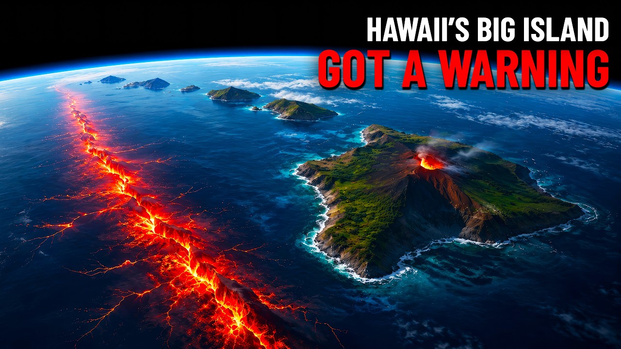
A 6.0 Just Hit Hawaii — And It Came From The Wrong Place
TerraWatchHQ
115 views•2026-06-03

The Split-Second Mistake That Made Bouncing Bettys So Deadly
NoMansLandChannel
253 views•2026-06-02
Nobody Expected This Lava Reaction 🤯 #faits #facts
TendzDora
28K views•2026-05-30

The Difference In Charged And Neutral Particles
heavybrainspace
959 views•2026-05-29

The Silent Memory of Glass
UnchartedScienceworld
146 views•2026-05-30

A380 vs Every Vehicles Crash Test Challenge | Which One Win?
BeamLap
163 views•2026-05-29