Soviet anti-U.S. propaganda posters evolved from depicting America as an external war-monger (1946-1953) to exposing internal American contradictions like racism and inequality (1950s-1960s), using sophisticated visual metaphors, photo montage techniques, and repeated iconography to shape public perception and justify Soviet ideology, ultimately becoming a form of soft power deployed globally during Cold War tensions before collapsing with Gorbachev's Glasnost policies.
Install our extension to search inside any video instantly.
The Art of Soviet Anti-U.S. PostersAdded:
By the late 1950s, millions of Soviet citizens encountered American culture not through travel or trade, but through vivid illustrations designed to warn them of moral decay and imperialist violence lurking across the ocean. In 1958, the Soviet Union staterun poster studios employed more than 300 professional graphic artists whose primary mission was to distill complex geopolitical narratives into single unforgettable images that would hang in factories, schools, and metro stations from Vladivosto to Minsk. But how did a nation that banned most foreign advertising managed to create propaganda imagery so sophisticated that Western intelligence agencies collected and analyzed each new poster as evidence of shifting Kremlin priorities?
The answer begins not with ideology alone, but with an entire infrastructure built to manufacture public opinion at industrial scale. The TAS windows workshops, descendants of the wartime propaganda machines that had churned out anti-fascist imagery during the Great Patriotic War, transformed after 1945 into permanent institutions. These were not underground cells or fringe operations. They occupied state-f funed buildings in Moscow, employed union protected artists, and operated with quotas, deadlines, and annual production targets set by the central committee's department of agitation and propaganda.
By the time Nikita Kruev consolidated power in the mid-50s, the system had refined its methods to an exact science, and the United States had become its most lucrative subject. The artists themselves inhabited a strange professional space. Men like Victor Kitki, Victor Ivanov and the husband wife team of Nikolai Dolgarukov and Nina Vatalina were trained at Vika Hutimas and other elite Soviet art schools where constructivism and socialist realism fought for dominance throughout the 30s.
By the time the cold war ignited, they had survived Stalin's purges, wartime deprivation, and the relentless ideological scrutiny that came with producing state sanctioned art. They were not hacks. Many possessed exceptional technical skill, fluency in lithography and screen printing, and an intuitive grasp of visual metaphor.
Their challenge was to make the distant and abstract feel immediate and personal. The United States, after all, had never invaded Soviet soil, had not occupied Soviet cities, and remained for most citizens an almost mythical adversary known only through filtered reports and official narratives. If you're watching this because you want to understand the mechanics of how states manufacture perception and deploy imagery as a weapon, consider subscribing. This channel exists to uncover the overlooked systems and forgotten operators behind Cold War decisions, one declassified detail at a time. The posters themselves followed templates refined over decades, but the anti-American work introduced new visual vocabularies. Early postwar posters produced between 1946 and 1953 depicted the United States primarily as a wararmonger preparing for atomic conflict. These images featured mushroom clouds, skeletal bombers, and Uncle Sam rendered not as the jovial recruiter of American war bonds, but as a top-hated plutoaucrat dripping with dollar signs and clutching missiles. The aesthetic was blunt, almost medieval in its symbolism. The enemy was externalized, monstrous, easy to identify. Artists worked with a limited color palette due to material shortages, relying on red, black, and white to maximize contrast and legibility from across a crowded factory floor. Then came the thaw.
Kruev's rise in 1953 brought tentative cultural exchanges. The first cracks in the information curtain and with them a problem for the poster artists. How do you demonize a society that Soviet citizens were now glimpsing in news reels, hearing about in jazz recordings smuggled through Eastern Europe, and even meeting in limited diplomatic or academic contexts. The solution was a shift from depicting external monsters to illustrating internal contradictions.
The new wave of anti-American posters produced between the mid-50s and mid60s focused less on war and more on hypocrisy, inequality, and moral rot within American society itself.
Victor Kitki, who had produced some of the most iconic images of the war years, became a master of this updated approach. His 1960 poster showing a black man lynched beneath the Statue of Liberty, required no cerillic text to communicate its message. The image traveled across borders, reproduced in leftist publications from Paris to Jakarta and became a fixture at international conferences where Soviet delegates sought to counter American criticisms of human rights abuses in the Eastern block. Caretsky understood that the most effective propaganda does not argue. It presents a visual equation so stark that the viewer completes the argument themselves. The Statue of Liberty, symbol of American freedom, juxtaposed with the lynching, symbol of American terror. No speech required.
These posters arrived at a moment when the Soviet Union desperately needed to justify its own system to a population that had endured famine, purges, and wartime losses numbering in the tens of millions. The implicit promise of Soviet socialism had always been that suffering today would yield utopia tomorrow. But by the late 50s, tomorrow kept receding.
Meanwhile, fragments of American prosperity seeped through the cracks.
The 1959 American National Exhibition in Moscow, where Nixon and Kruev staged their famous kitchen debate, exposed thousands of Soviet visitors to color televisions, modern appliances, and consumer abundance that sharply contrasted with the chronic shortages defining Soviet domestic life. The poster campaigns intensified in response.
Artists received directives from the agit prop department outlining themes for upcoming production cycles.
Declassified memos from this period reveal a bureaucratic process far more intricate than the spontaneous outrage the posters themselves suggested. A typical directive might specify that the next quarter's output should emphasize American racism, unemployment, or the arms race, depending on current diplomatic priorities or domestic concerns the leadership wanted to deflect. Artists submitted sketches for approval, revised based on feedback from committee reviewers and only then moved to full production. The system allowed for some creative latitude. The better artists earned privileges and higher pay, but deviation from the approved narrative invited professional consequences or worse. The visual language evolved in fascinating ways. By the mid60s, poster artists had begun incorporating photo montage techniques borrowed from avantguard traditions that had been suppressed during the high Stalinist years. This created images of unsettling hybridity. Photographs of actual American scenes, riots, breadlines from the Great Depression, police confrontations during civil rights marches combined with drawn elements like grasping hands, chains, or dollar bills transformed into nooses.
The effect was to blur the line between documentary evidence and editorial interpretation, presenting what appeared to be photographic proof of American barbarism while actually constructing highly selective and manipulated narratives. One 1964 poster by the Kukrin Collective, a trio of artists operating as a single entity, showed the map of the United States covered in military bases, each marked with a missile icon surrounded by smaller nations depicted as targets. The title read in bold cerillic, "Imperialism's true face." The poster appeared just as American involvement in Vietnam escalated, and it served dual purposes.
Externally, it positioned the Soviet Union as a defender of small nations against American aggression. Internally, it justified the enormous military expenditures that diverted resources from consumer goods. The poster's message was that Soviet citizens sacrificed not for imperial ambition, but for collective security against a global threat. Accuracy was never the priority. What mattered was emotional resonance and alignment with state objectives. Some posters exaggerated genuine American social problems to grotesque extremes. Others invented scenarios wholesale. A 1967 poster depicting American soldiers bayonating Vietnamese children drew from real atrocities but stylized them into iconography that transform specific war crimes into symbols of inherent American evil. The artists were not investigative journalists. They were visual rhetorics employed to make the state's case as compellingly as possible within the aesthetic conventions of socialist realism and its evolving offshoots. Yet the posters also reflected authentic anxieties. The artists and their overseers lived in a society that genuinely feared nuclear annihilation that remembered the devastation of the last war and that viewed American encirclement through NATO bases and strategic alliances as an existential threat. The line between cynical manipulation and sincere belief blurred in complex ways. Many artists likely internalized the narratives they illustrated, having spent careers immersed in state controlled information ecosystems. Others may have privately harbored doubts, but recognized that their professional survival depended on enthusiastic participation in the system. The posters thus became documents of both propaganda and the psychologies it shaped.
The anti-US poster campaigns reached their apex during the late 60s and early 70s, coinciding with peak cold war tensions over Vietnam, the arms race, and proxy conflicts across the third world. Production numbers soared. A single popular design might be printed in runs exceeding 100,000 copies, distributed not only within the Soviet Union, but also shipped to Allied states, communist parties abroad, and international front organizations. The posters became a form of soft power, visual arguments deployed in the global competition for ideological allegiance in places like Angola, Nicaragua, and Afghanistan before the Soviet invasion.
These images circulated alongside other forms of material support, helping to construct a narrative of American imperialism versus socialist liberation.
The technical quality varied widely.
Prestige projects intended for international audiences received more resources, better paper, more sophisticated printing. Domestic posters for rural districts or factory walls were often crudder, printed quickly on cheap stock that faded within months.
But even the roughest examples adhered to core design principles. Bold compositions readable at a distance, limited text to accommodate viewers with varying literacy levels, and visual metaphors drawn from a shared symbolic vocabulary that had been drilled into the population through decades of exposure. Certain motifs recurred with almost ritualistic frequency. The American dollar often depicted as bloodstained or morphing into weapons.
The capital building or the White House shown crumbling or overshadowing starving masses. Uncle Sam rendered as a vampire, a wararmonger, or a puppet master controlling smaller figures representing US allies. The repetition was intentional, reinforcing through sheer volume a set of associations that would become automatic. See the top hat and stars and stripes. Think exploitation and violence. The posters functioned as a visual catechism teaching the faithful how to interpret world events through an approved ideological lens. Parallel to the anti-American campaigns, poster studios produced works celebrating Soviet achievements, agricultural output, industrial production, space exploration. The contrast was deliberate. The viewer was meant to see not just American villain, but Soviet heroism, not just capitalist decay, but socialist progress. The anti-US posters were one half of a dipic. The other half showed happy workers, abundant harvests, and rockets piercing the sky. Together, they constructed a moral universe in which the choice between systems was obvious and the path forward clear. But the system contained contradictions the posters could not resolve. By the 1970s, as Dayton softened superpower relations and Western consumer goods began trickling into Soviet markets through official and black channels, the stark binaries the posters presented grew harder to maintain. Soviet citizens who managed to acquire Levi's genes or Beatles records reconciled these private pleasures with public denunciations of American culture through a kind of cognitive partitioning common in authoritarian societies. The posters remained on the walls, but their power to shape perception weakened as alternative information sources proliferated, however slowly. The artists themselves began to face diminishing returns. Younger generations trained in the 60s and 70s found the aesthetic conventions stale and the political messaging increasingly hollow.
Some pushed for more experimental approaches, incorporating pop art influences or more ambiguous imagery, but the bureaucratic oversight structure resisted changes that might confuse the message. By the late '7s, the anti-American poster had calcified into a formulaic genre, still produced in large quantities, but generating less genuine engagement or emotional response. The same images that had once felt urgent now seemed routine.
Background noise in an increasingly cynical society. The final major wave came during the early 1980s as cold war tensions flared again under Reagan's military buildup and aggressive rhetoric. Poster studios received renewed directives to emphasize the American nuclear threat, the danger of persing missiles in Europe, and the recklessness of US foreign policy. The resulting work often recycled visual strategies from the 50s, mushroom clouds, and skeletal bombers as if the intervening decades of stylistic evolution had never occurred. The campaigns felt desperate. A return to basics when more sophisticated messaging had failed to stem growing domestic disillusionment. Within a few years, the entire apparatus would collapse.
Gorbachev's Glasnos policies after 1985 loosened restrictions on information and the carefully constructed narratives the posters had reinforced for decades crumbled under scrutiny. Newspapers began publishing critiques of Soviet failures. Television showed unedited footage of Western life and the moral authority the state had claimed evaporated. The poster studios continued operating for a time, but their mission became unclear. How do you demonize the enemy when official policy now emphasizes cooperation and openness?
Some artists transition to commercial work. Others retired or immigrated during the chaotic '90s. Today, these posters survive primarily as collectibles and historical artifacts.
Western auction houses sell original prints for hundreds or thousands of dollars to buyers fascinated by Cold War ephemera. Museums mount exhibitions examining them as examples of political art and visual propaganda. Scholars analyze them for insights into Soviet ideology, state society relations, and the mechanics of mass persuasion.
Stripped of their original context, the posters can appear almost quaint, relics of a conflict that ended without the nuclear exchange they so often depicted.
Yet their legacy persists in subtler forms. The techniques Soviet artists developed, the integration of visual metaphor with state messaging, the use of repeated iconography to condition reflexive associations. These methods did not disappear with the Soviet Union.
Modern states and non-state actors deploy similar strategies through digital media using memes, infographics, and viral imagery to shape perception and mobilize supporters. The medium has changed, but the underlying logic remains. Simplify complex realities into digestible symbols. Externalize blame onto a clear enemy. Reinforce in-group identity through constant repetition.
The anti-American Soviet poster was an analog predecessor to information campaigns now waged across social media platforms with far greater speed and reach. The artists who created these images inhabited a specific historical moment when states still monopolized the means of mass communication and when visual literacy was cultivated through public institutions rather than algorithmic feeds. Their work was constrained by political oversight, material limitations, and ideological boundaries they could not cross without personal risk. Yet within those constraints, the best among them achieved a kind of dark brilliance, distilling geopolitical struggle into images that communicated instantly across language barriers and cultural divides. This channel is viewer supported and runs on the contributions of people who value this kind of deep research into Cold War history. If you found this useful, there's a Kofi link in the description where you can help keep this work going. Understanding the art of Soviet anti-American posters means recognizing that propaganda is never just lies, but rather a selective truth amplified until it drowns out competing narratives. The posters depicted real American racial violence, real poverty, real militarism, but they did so in a context that obscured Soviet equivalence and served state interests rather than genuine humanistic concern.
They were tools designed to manage a population's perception of a world most would never directly experience, to make the distant feel immediate and the abstract feel personal. In that sense, they succeeded brilliantly, not because they told the whole truth, but because they understood which fragments of truth, rendered in bold red and black, would lodge deepest in the imagination and serve powers purposes most effectively.
Related Videos

Futurism: The Radical Art Revolution That Predicted the Modern World
HENITalks
154 views•2026-05-29

Jack Levine, Witches' Sabbath
smarthistory-art-history
471 views•2026-05-29

고가 중국도자기 경매
고가古家고도자기경매
203 views•2026-05-29

क्या भगवान शिव हारिती की नकल हैं? झूठे दावे का पर्दाफाश | हारिती बौद्ध देवी बनाम भगवान शिव
sanatansamiksha
1K views•2026-05-30
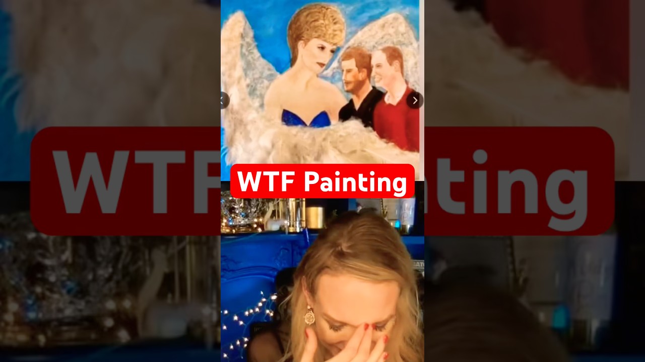
Princess Diana, William and Harry Cringe Art
RHRJen
2K views•2026-05-31

This is one of the biggest street art exhibitions in London but there’s a twist 👀 Danish
ExploringLondonCity
1K views•2026-05-30
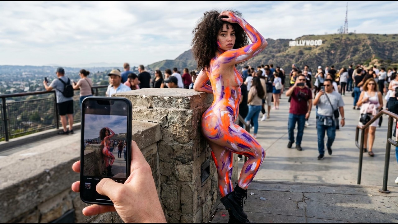
How Hollywood Body Art Changed the Way America Sees the Human Body Forever
Ink_and_Instinct
213 views•2026-06-02

Gudok Bull #4 #gudok #instruments #russia #russian #ancient #ancienthistory #sunoai #suno
aimechanicalbull
289 views•2026-05-29