A lucid breakdown of how cartographic trade-offs distort our perception of global proportions. It serves as a vital reminder that every map is a strategic choice between geometric accuracy and functional utility.
Install our extension to search inside any video instantly.
Why Are Maps Lying To Us 🤯Added:
Africa and Canada [clears throat] look almost [music] the same size on most world maps, but that's completely misleading. Flat world maps stretch [music] countries near the poles, making them appear much larger than they really are. Since Canada is so far north, it gets heavily [music] distorted in size.
Africa sits much closer to the equator, so its true scale gets visually underestimated. And the difference is massive. Canada is about 10 million square kilometers, while Africa is over 30 million. That means Africa is actually more than three times larger than Canada. You could fit multiple Canadas [music] inside Africa and still have space left over. So, the map most people grew up looking at has been completely distorting the true size of Africa.
Related Videos

OpenHuman VS Hermes AI: Who Wins?
JulianGoldieSEO
285 views•2026-05-29

Long-Running Agents — Build an Agent That Never Forgets with Google ADK
suryakunju
142 views•2026-05-30

5 Mind Blowing Omni Uses Cases
PaulJLipsky
1K views•2026-06-02

This computer is made from real human brain cells. And you can buy it.
Talktmsmedia
3K views•2026-05-28
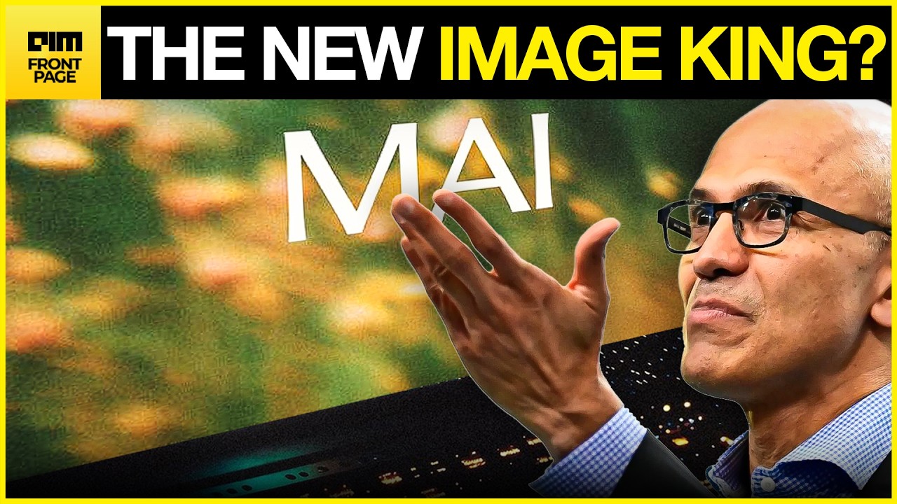
BREAKING: Microsoft’s New Image Generating Model Beat Out GPT 1.5 and Nano Banana 2
aimmediahouse
122 views•2026-06-03

I Made the Same Anime Fight Scene in Every AI Video Generator
NobleGooseAnime
295 views•2026-05-30

Nvidia Bets Big On AI PCs | New Chip To Power Windows Laptops | Technology | AI Updates | N18S
cnnnews18
3K views•2026-06-01
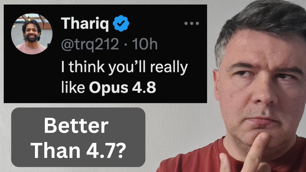
I Tested NEW Opus 4.8 on Four Projects (Updated LLM Leaderboard)
AICodingDaily
298 views•2026-05-29