This analysis effectively captures how Silver Age artists transitioned from simple illustration to sophisticated visual storytelling through dynamic composition. It is a concise masterclass in the era that fundamentally redefined the modern comic book aesthetic.
Install our extension to search inside any video instantly.
Greatest Comic Book Covers Part 2-Silver Age🔥Added:
I'm Brandon. And I'm Brian. And we're B&B Comics.
>> [music] >> Welcome everybody to the B&B Batcave in Minneola, Florida. It is time for part two of our series the greatest comic book covers of all time. So Brian, what are we doing this time? Uh this will be the Silver Age. Silver Age of Comics. So we already did the Golden Age, so you can click on our channel, you can go back and watch that if you want to. A lot of great books in there, was a lot of fun. So now it's on to the Silver Age. And I think I speak for both of us we're Silver Age guys. Yeah, for the most part. If we had to pick an era Silver and Bronze, yeah? Silver is kind of our wheelhouse and I think this was probably the hardest list that we put together. I mean the Golden Age was difficult, don't get me wrong.
But Silver Age, we've had so many of these books, we have so much emotional attachment to these books. To try to Yeah, I don't even know if I like my list.
>> [laughter] >> We're going to find out. You tell us if you like it or not. I almost like want to redo it every time I look at it.
That's true. Yeah. Yeah, it's just doing a top 10 and just this wasn't as much fun as the Golden Age. Yeah, I I I think I agree with that too cuz I had less on the top of my head for the Golden Age that I knew was going to be on that list. The Silver Age, I had like nine already and I'm like, well I'm I'm going to look through some more covers. I'm I'm going to have to cut a lot of things out of here. And that's what happened. It really it was really hard. I mean the honorable mentions that we have are absolute bangers. I mean, how could they not be on the list? So I [snorts] guess without further ado, let's start off. So uh again, we made different lists. My 10 is different from Brian's. We did not talk about it beforehand. So if we have overlap lap, that's pretty cool. But uh I don't know what he has on his list until he shows me the picture on his on his iPad over there. So uh let's start off. I will get the party going with the honorable mention from the Silver Age, which is Vampirella number one. And that is 1969 Frank Frazetta uh origin of first appearance of Vampirella. It's the introduction to planet Draculon.
Uh was a large format book. It's basically a magazine.
Um Frazetta. It's kind of hard to keep Frazetta off your list, right?
>> Oh yeah, he makes my list. And and technically this is my honorable mention, so he's not actually on my list, which is crazy enough to say. But it's beautiful. We've owned this a few times. Um we've seen it up close.
I saw a picture of the original art during Mega Con. Somebody showed me uh I think it went up for sale. Just lately?
Oh, did it? Uh that cover went up on Heritage Auction maybe just last month or so.
>> That had to be in the millions. Um but there is there is no clothing.
Yeah.
>> [laughter] >> The clothing was added from the from the original art. Oh, that's right. Oh, I know what you're talking about now. All right, okay. Yeah, I got it.
>> the original it's it's you know, obviously uh more profound when you see it, but it's it's not why it's a great cover. I'm just saying that he didn't draw the bathing suit. It was like added two or three to make a comic comic book cover.
>> pretty crazy.
>> Yeah, so Pretty crazy. So that's my honorable mention Vampirella one classic Frank Frazetta. Uh awesome. Good pick for an honorable mention.
>> [laughter] >> An honorable mention is crazy. If you did watch our Golden Age top 10, you'll probably you understand why I picked this book. So my honorable mention is Fantastic Four number one.
>> Ooh, that's a big book, man. I mean it's Marvel's big book.
>> Yeah, it's the first family of Marvel.
Yeah, and it's the first uh time that Marvel uh did a comic book under the Marvel name. You know, it wasn't uh Timely or Atlas or anything like that.
So it's the first Marvel comic book under the Marvel uh title. It's from 1961 uh Jack Kirby uh Stan Lee uh you know, you get the first Mole Man.
Uh it's it's a cool cover.
Um I imagine it grabbed a lot of attention. It was like, what is that? Uh so >> So pretty cool. People are probably very accustomed to seeing you know, you got Flame and Human Torch uh so you probably but the others was like, you know really really wild characters and to follow this storyline. So very impactful book uh put Marvel on the scene and it starts off the Silver Age. Uh my list is you know, obviously Marvel now shows up on these list. Right.
>> And so very impactful and that's why I picked it. I mean the art and everything else, it's cool, but it's more for the importance of the book for that era and it kicks the era off.
>> I was going to say it kicks off Yeah.
for Marvel. Yeah, yeah, that's Absolutely.
>> Age really. Yeah, so that's my honorable mention uh FF number one. I mean to have an FF one as your honorable mention is crazy. It's crazier that it's not even on my top 10. That's what's crazy. So you'll get to see what kind of weirdo I am. Starting off at number 10, I'll get us rolling here.
I have Amazing Spider-Man number 66.
So that is Oh, did I not write anything?
How come I didn't write who who did this cover? Well, I should know. I mean it's John Romita Sr.
Beautiful cover. I I I like Mysterio's colors and I like his costume more than any other Spider-Man villain.
Green Goblin, Doc Ock are really cool, but when it comes to the suit, the green and and purple, I think that's the best one. So uh the fact that he is large, kind of imposing, um you know, you got the little smoke coming up and all that. It's just the colors pop on it. And for ASM, at least in the Silver Age, that is my favorite cover. So it it comes in at number 10 on my list.
>> My number 10, not a lot of people think about it, but when you see it, it's a book you stop and look at and you're like, that's cool. So it's a Batman 194.
Okay.
>> So uh Carmine Infantino uh from 1967 from DC. So it's got the title interaction.
>> Yeah. You might be more familiar with other books that are a lot you know, not as old as this that have the title interaction. You're like, well that's really neat. Well, it had been done before.
Um and Carmine did an a fantastic job here. The red background which is familiar in Batman books. A lot of deep reds in the background, but he looks like he's flying. So Batman is in a position where he looks like he's flying and so it's it's cool. It's jumping out of the pages. So that's my number 10 for the cover for the colors and for the title interaction. It's pretty cool.
That's an it's an interesting cover.
I've seen this and we've had this before and I do like it. It's cool, but I never really thought about it as Batman flying. Yeah. Or something like that with the with the >> looks like he's flying or he's jumping out of a helicopter.
>> Right.
>> [laughter] >> He so the way he's drawn, he's he's coming in fast.
>> Yeah, he's got a boost there somewhere.
Very cool. So that's number 10. So we're going to go up to number nine. Number nine.
Interesting. I didn't think you saw that coming. No. It is Hulk number 104.
It is a Marie Severin uh Incredible Hulk and Rhino cover.
It's really cool. The the Hulk is basically looks like he's asleep almost.
He's he's pretty much defeated and the Rhino's charging at him. It's a really cool battle cover.
Um Marie Severin also very underrated. Mhm.
I say a lot of her covers I think it's Kirby covers.
And they're really hers. So she's I mean she's amazing. Um it's a I would say it's an overlooked copy or an overlooked book for the most part.
Um like the the Hulk 102 gets a lot of you know, big premiere issue.
>> Did she do some more of the early run of the when they I believe she did. I don't know all of them, but she did like uh there's the missing link cover. Missing link 105.
>> Yeah. And the 103 I don't know if you have that one or not. You have the one and the two.
>> Right. There's some maybe she did more, but yeah, those cover those covers are cool. That's a cool cover.
>> Yeah, and it's for a book that uh to be honest is not a big seller.
It's not a very expensive book. Doesn't mean it can't have a beautiful cover and be really cool. So it's not a super sought after book, but I when it comes to Silver Age again, I I sifted through so many books and I really wanted it to just be that's a cool cover when I looked at it, not the importance of it or anything. So that is my number nine. All right, my number nine >> Oh ho ho.
>> Brandon's not going to disagree with this one. No, I don't. It's way too low though. Fantastic Four number 49.
>> it's so beautiful. So Galactus, you know, on the cover with Fantastic Four and Silver Surfer.
Um the colors, the green and again, like you said the the um the ominous uh background character >> the impending doom and yes.
>> doom Means a lot for me. over Galactus and it just over the Fantastic Four and just it gives a lot of depth right when you use color like that and a character is much larger than the rest. And Galactus is He's massive, yeah.
>> he's as big as he wants to be, right?
>> Yeah, pretty much. Um so uh cool cover.
I like the colors. I like the characters. Uh the importance of it. So um I don't think I've explained much, but Jack Kirby and Joe Sinnott, it's from 1966 Marvel.
Uh so Fantastic Four 49 is my number nine. It is abs- it is such a beautiful cover. Anybody in a has a top 10 that does not put that on there, never speak to that person.
>> [laughter] >> They don't know what they're talking about. Beautiful and that was number nine, correct?
>> on eight. Okay, we're at number eight.
So, I have >> [laughter] >> This is going to be another one people are going to be like, "What is that?"
It's Detective Comics number 241, 1957, Sheldon Moldoff.
It is interesting for a couple reasons. So, it is the rainbow Batman.
So, he has different suits, different colors that he's using for whatever time period. Every day he wears a different suit. And I just really like cuz I I've never seen a cover like that. I've never seen uh Wolverine wear a different suit although he has different suits like every day.
Like that's not a concept. Superman doesn't change his suit. You know what I mean? Like like something like this is a concept I'd never seen before.
And I thought that was really cool. So, it's the rainbow Batman. All the different suits in the background. He's explaining that he must wear a different colored Batman costume every night. I think it's very different.
That's probably what drew it to me. And all it's just got a lot of color to it.
Yeah, who did that? Uh Sheldon Moldoff.
Nice. Who is uh pretty good artist from that time. So, that is my out of left field number Number eight.
All right. My number eight is uh another Frank Frazetta. Ooh, sick.
>> So, Creepy number five.
>> Yeah, that's So, sometimes you look at covers like this and you don't look close enough. Okay.
You you might just see it looks like it's a painted cover and it's got some, you know, motion in the it's almost Where are the characters? Where are your eyes supposed to go? Mhm. But when you start focusing in this and you see the detail, the fine detail in the background >> Yep. of this, it's an ominous, dark, eerie, creepy uh cover. I mean, obviously Dracula and the bats and then you've got some soul like They got the moon, the fog. It it's I don't know, it stands out to me as one of Frazetta's better covers. Um I do have written down here as a backup, don't forget about Vampirella number one. He's already covered it. So, um you know, people will point point out the most famous covers. They're not always his best covers. I agree. Yes.
>> Right? So, but my number eight, Creepy number five, Frank Frazetta from 1965.
It's a magazine size. It's from 19 It's a Warren publication.
>> Yeah, large format. That's interesting because it looks like it's kind of hard to see some of the stuff in there.
But then again, it's still detailed.
Yeah. I don't know how you I don't know how you achieve both things. It's almost like he did this and then something went over top of it to where it's just hard to see. It's like I don't know how you make it detailed but yet kind of hard to see it.
Right. It's it's it's a weird concept, but there is a lot going on on that cover. Yeah, check out Frazetta art for sure. Especially the the magazine stuff.
Anything magazine size that Frazetta ever did, that's his that's his best work in my opinion.
>> Really really cool. Beautiful.
>> [snorts] >> And that is your number eight. So, we are jumping to number seven. So, number seven on my list was one of the books that I knew was going to be on this top 10 off top my head. And that's Avengers 57. And that is John Buscema. I know you love John Buscema. John Buscema is a beast. One of my probably top three artists of all time. Absolutely.
>> Cover artist, yeah. 1968.
It's the first appearance of Vision.
It's the second appearance of Ultron.
It doesn't matter if this was his first appearance.
Again, according to this cover, villain or vigilante or anti-hero cuz we don't know what he is yet.
And then you have Avenger characters much smaller on the ground, smoke, clouds. Again, another dark background, lots of reds.
It's kind of a theme with me. I guess I like black and red.
Um it's beautiful. He's very imposing.
>> Yeah, well, the pink I wouldn't worry about >> [laughter] >> I wasn't worried about that part. But, you know, he's got his hand just out like that. It's his pose.
Everything about it. Behold the Vision is very very cool.
I like that a lot.
You know, when it comes to Avengers covers, I think 57 is amazing, 25, which is a great Doom cover.
To me, those are the best. I really had a decision to pick between the two. And I think the difference of 57 making the list is the colors. The colors just pop more than than 25 does with with the Doom cover. So, yeah, Avengers 57, first Vision, second Ultron.
Beautiful Buscema.
Uh number seven on the list. All right, my number seven, another great artist, very famous, did a lot of covers in that silver and bronze age.
>> Dude, Jim Steranko.
I Nick Fury Shield number one. I had to do everything I could to not put that on the list. Because I have multiple Sterankos on my list.
Yeah, it's right there.
This is absolutely amazing. And then, I know I'm kind of hijacking your spot here, but number one's beautiful, but number four My list is better than yours.
>> is beautiful.
>> [laughter] >> I don't think so. I don't think so, but you will tell us which one you like the best. So, 1968. Um I Well, I got props here. So, Jim Steranko Shield number one. And if you go through Shield two, three, four, five, six, seven, uh they have a theme. I mean, there's just this you don't know where to look. You don't know if this is forward or this is in the back. Mhm. And so, if you got to do some research on artistry, but if you ever not heard about this guy, you probably have, you need to research him. Salvador Dali, okay? Um absolutely incredible. And where we live here in Central Florida, we're only a couple hours from his museum in St. Petersburg.
>> Yeah, you been to it?
>> Yes.
>> Yeah, I've been to it uh with Natalie a few few years ago. Yeah. It's impressive. Yeah, you take the tour cuz when they start explaining stuff. And the thing is his art is like 14 ft high and 6 ft wide. Like it's on Yeah. It's massive canvases that he you would be on ladders to to paint. And he paints over and over and over. So, they x-ray the his paints and he has like five or six different uh paintings on top of each other. Wow. It is absolutely insane. But Salvador Dali. So, I believe Steranko, I haven't had talked with him, but then I do some research on it. I feel like he's been influenced by Salvador Dali. We Yeah, I can see it.
So, I got a couple that I just want to show you out of the book here and you could see, you know, the similarity to a lot of Like I said, I think Nick Fury number seven. Seven's the one that has like the like the melting clock on the side, right? So, let's just show the clocks and then we'll move on.
So, there's one of Salvador Dali's clock.
So, you can see the influence there.
It's actually on the back cover, by the way. Just realized. There you go.
There's the clocks. I didn't have to go to it. And then, you know, just the use of depth and just sometimes odds. Like he'll just have a piano floating or a piano melting.
>> Right. Like you're like, "What is that about?"
>> What does it mean? Yeah, yeah, yeah. So, very cool. But anyway, uh Nick Fury Agents of Shield number one, Jim Steranko. Beautiful one. Steranko is a That is my number seven. Number seven, all right. I Well, I'm not going to tell you what's on the list or not, but I love it. It should be on people's list.
Um so, we're up to number six. Yeah.
Talk about a curveball.
I know for a fact you've never seen this cover coming up. It is Wonder Woman number 192.
Not 1971, Mike Sekowsky and Dick Giordano cover.
So, couple reason I picked this. So, in this range and just after that, there's a lot of bondage covers. Like we know all the like the Wonder Woman bondage. And there was some from this era that I could have picked, but I wanted to I've seen this book a long time ago. I've never owned it.
But I do like See if I can explain this. So, Wonder Woman is missing her shield.
She's missing her helmet. Her sword is broken in half.
So, she's pretty much down and out.
There's another female soldier with I think badass armor, super cool. Love the colors.
The skulls and everything. And she's pretty much down and out. So, she's beat.
What is that guy in the background doing? I call that the standing crucifix. I don't know what it is. He's not really up in the air, but he he's it's bondage. There's some form of bondage. And also in the back, you look it looks like opposing armies.
So, what I think of when I see this, and it doesn't mean this is how this was was drawn, but back in the day, even in um you know, Game of Thrones like shows and all that, uh sometimes armies would put out their best warrior to fight one-on-one and whoever won, that was it to spare bloodshed.
It kind of looks like that's what they're doing cuz they're not fighting in the background. They're waiting.
So, it's almost like they're trying to sort it out to see who's victorious.
Yeah, and he's And Wonder Woman's getting her ass kicked, too.
And he's just being tortured to watch.
>> And he doesn't know what he's doing there. Yeah, so I think it's a very Who drew that?
Mike Is it Sekowsky? Okay. And uh I think the inker was Dick Giordano. So, I think it's super cool. Very very unknown cover. I've only seen it one other time before I started going back and doing research. I think it's amazing. And yeah, yeah, I Tell me in the comments if you've ever seen if you've ever seen that book. I don't think a lot of people have. That was your number six? That is six, yes. All right, so my number six is, you know, rinse and repeat. Here we go. Avengers 57, John Buscema from 1968.
Uh Brandon gave you his why it made the top 10 list. Mine similar.
It's only like three simple colors on this. I mean, there's red, black, and white or variations of those colors. And it stands out as you can't stop looking at this cover. I mean, if you had 100 books laid out on a on a table, your eyes would go to this if not if anything else.
Just exceptional use of depth and color.
I love I love Buscema. I love So, easy pick for me, easy number six. Avengers 57.
Yeah, he's one of the best. I mean, I I mentioned it earlier, that doesn't have to be a first appearance. It's just the cover is so nice. It doesn't matter who that person is that's up really big. It could be any villain, it could be any unknown character, but it's such a beautiful example of like you said, it's literally three colors. It would be on the top 10 even if it wasn't the first Vision. Beautiful cover.
All right, so my number five Batman number 237.
1971 Neal Adams, first Reaper.
In the story they drew Bernie Wrightson, Gerry Conway, and Alan Weiss into the story.
Had something to do with Halloween.
Neal Adams had a lot of good Batman covers. I mean, he started at what, 200?
And he ran all the way up to 250s or 260s.
So, trying to put this in the right spot. This is This is right at the edge of what we consider the Silver Age.
227 was a possibility.
But since it was an homage, I decided not to do it.
So, I really like again, it's a red Something with a red background, dude.
It's either a dark background or red background. For some reason I just love it. So, Batman, Robin, you got the Reaper with his big scythe.
Knight of the Reaper.
Really cool book. We get it a bunch of times.
It's just really popular. It's a great cover. It is a first appearance as well.
So, that is my number five, Batman 237, Neal Adams cover. All right.
So, my Batman number or my Batman number >> [laughter] >> My number five.
It's It's a really cool book. And when you first see it, and I know we're going to do you're going to do some overlays on here and you know, you'll see the cover. But Savage Tales number one That's pretty cool. When this first comes up, and I'm not going to tell you who the artist is, you're probably leaning towards more like Frazetta or something. Yeah. Okay.
I can see it.
>> So, this will show the range of my favorite artist.
>> Here we go. John Buscema. Buscema. So, the Savage Tales number one, that is a Buscema cover.
You know, I didn't do as I might be painted.
Could be a painted cover.
>> like a painted cover, yeah. So, 1971, Marvel.
The cool thing about this, I mean, it is the first appearance of Man-Thing.
Right? Nice. Who actually came out before Swamp Thing.
Even though there was a little I read on the history of that. Actually, you mentioned just a couple people lately, Gerry Conway [clears throat] and Len Wein. So, they were roommates.
And Stan Lee came up with the idea of Man-Thing, gave it to I think the editor at the time was Roy Thomas.
So, they kind of obviously I I read on this it was pretty cool little story.
They gave it to Gerry Conway [clears throat] to do this back story and write the do the script of it. And then less than a year or two later Swamp Thing comes out and Len Wein is writing that script. So, there was going to be a lawsuit. Marvel was going to file some claim, but because the characters went in two different directions and they didn't really overlap other than their origin story was kind of similar they left it alone. But that's interesting. You know that the creativity that people bring them if you're hanging around people that are always, you know, doing this you it's going to end up So, obviously something happened when they were roommates and they were discussing these origins of these characters that if one came up with Man-Thing and one came up with Swamp Thing less than a year apart.
That's pretty interesting. But anyway, you brought up those names just a moment ago. But straight Savage Tales number one, John Buscema and the importance of this book, not only is it the first appearance of Man-Thing, but it's also my month and year book. Oh.
>> Yeah, how about that? You got to find like the first appearance or the cover or the book that would be most you know, have the most impact to you that is matches the month you were born in the year.
So, I mean, you obviously can do the research. May '71, that's my birth month and year, and this would be my book. And I have looked to buy this book. I've seen it in very very low grade. I haven't come across one that I want to put in my PC, but it will happen at some time. Cool cover. We haven't really talked much about it, but it's a very like Conan-ish, you know, you got a decapitation, you got a bloody sword. It's violence.
Violence. Barbaric. Kind of dark, yeah, yeah, yeah. barbarians.
So, really um it's a pretty dark image It is. of a cover. It's not something that you want to show the kids, but that's my number five. I know that was a long-winded five.
>> That's a great book, though. That's my number five. And speaking of which, my birth book, if you want to call it is the first Lobo. June of '83.
So, Mega Man number three, June of '83 is my birth book. I don't know of another key that's around that time, but I'm going with Lobo there. So it explains a lot.
Um So, we are at number four on our list.
Can't wait for this cuz this easily could be number one.
Easily. So, the top four on my list have been there forever. They've always been my four Silver Age. It's just the order that you put them in.
So, I went with the great Jim Steranko in Hulk Annual 1 from 1968.
Beautiful title interaction.
Title and I guess footer interaction cuz he's stepping on the Inhumans down here.
Um Great pose. The green, the purple, you have yellow, orange purple kind of How would you call it?
Layered.
Orange. I guess that's red, actually. As it goes up King-Size Special. There's There's not an enormous amount of either giant size or annuals that are like really cool or valuable, so to speak.
But this is one of them and it's fantastic Steranko art. Beautiful colors.
No first appearance or anything, but it doesn't have to be. It's just a beautiful Jim Steranko cover from 1968.
And by the way, 1968 is a crazy year.
When I go through a lot of these, a lot of these books are 1968.
Avengers 57, Hulk Annual 1, couple more that I'm not going to mention cuz they're on my list.
They're like 1968 is the year. Now, you did mention Marie Severin earlier. Now, you've heard the story about this. She redrew the face on this cover.
>> Yes, I have heard that. So, and you said that she doesn't get >> [snorts] >> She doesn't even get an honorable mention. She doesn't get the credit.
But I guess our understanding is that either Steranko or somebody else didn't really couldn't get it right and she redrew the face on this cover.
That's pretty wild.
>> So, that's cool. Big big ups to her. So, that is my number four. All right, my number four, John Romita, Amazing Spider-Man number 50 from 1967.
The reds pop on this cover. That's the first thing you see. And then if you look a little bit closer, you look a little bit deeper, I think he's drawn Spider-Man as being angry.
It looks just the way that the eyes are shaped. It's in the eyes. He's in his posture with his shoulders. And Romita drew Spider-Man much bulkier, much bigger than than Ditko and other artists have drawn. So, he he is bulked up when Romita does it. But it does look like his shoulders are shrugged, he's angry, he's looking back. And then Peter Parker is I mean, he's sad. He's uh dejected.
>> I would say he looks broken.
>> Yeah. So, something. There's emotion in this It's sometimes Well, all the time it's hard to draw emotion into just a you know, a cover of a comic book. But when I see this, the reds and the way that the lining is done and the like you said, an ominous large figure in the back and then a small one in the in the forefront.
But it does draw emotion, at least to me, and I think it's one of Romita's best.
And in the ASM run in the Silver Age, this is my choice. This is number four >> [clears throat] >> on my list, ASM 50. And a And a really interesting thing about that cover is there's not much there. It's just him and then, you know, let's call it a silhouette of Spider-Man behind him. Yeah. There's no buildings, there's no nothing.
There's There's nothing else there. He's just walking.
But with nothing there and almost basically different shades of red it's pretty impactful. Yeah. For something that on the surface doesn't look like there's a lot there.
So, really cool. Really cool. Could have been on my top 10.
But it Oh my goodness.
Oh, you saw my number three?
>> I saw your I saw [laughter] your I showed them too early. Anyway, you're on the number three. Well, guess what?
It's the same It's the same. Okay, well let's do them at the same time.
>> All right, X-Men 50 1968.
The great Jim Steranko's on back-to-back Jim Steranko's. It's the second appearance of Lorna Dane.
Uh first cover of Lorna Dane who becomes Polaris.
Um second appearance of Mesmero. It is the origin of Beast and it's the first use of the classic X-Men logo. So there's a lot of things going on here.
It's only missing Polaris' first appearance. Really that's it. It's the second appearance.
Um Jim Steranko only did three issues of the X-Men, 49, 50, and 51.
This is his best.
Um and kind of like what we talked about with the X uh ASM 50, it's really there are some other colors but it's really all just green. Mhm. It's a green uh main color here but yet it's so beautiful. And you have all the rest of the X-Men are are down below. It's I guess it's against a dark background.
And you have some yellows, some molecules, magnetic force, whatever it is that is It's funny we have the same >> [laughter] >> We have the same date stamp on it too.
Um or images but it's just fantastic. Her outfit is amazing. Um kind of weird that she has her hand like that, the one that's down. I don't know what that is for. Yeah, she's missing a couple fingers.
>> [laughter] >> She's doing like the kiss. I know. I give Steranko all this credit, man. Put the freaking digits on there, man. But I it's absolutely beautiful. The first time I saw it many, many years ago before I even Before [laughter] I even owned it, this was one of the greatest covers I've ever seen in my life. Steranko, uh a very underutilized character in Polaris, and I mean, should be on anybody's top 10 Silver Age. So if I can show my number two now, are we going to Let's see if we're the same. What do you want to say about it? So if you don't If you don't understand, he's got it as his number three too. We actually matched the exact book and the exact place which is crazy.
Pretty cool. Uh I don't know if I I mean, I agree that the art is there.
Um it just stands out.
It's It just stands out.
>> Yeah. It's impressive. Uh when you when you do the depths and the colors like that and you pick a background, uh it it's like there's shadows on top of them [clears throat] even though it's I don't know. It's pretty cool. And the X-Men logo, it does belong on that cover. It's like a We call it like a block like a block logo as opposed to 49 which I think it was more not jagged. Do we have 49, 50, or 50 or any earlier ones?
>> Well, the earlier got number three there.
>> It's a little bit different. It just don't have any depth to it. It's like remember I mentioned Superman earlier?
Mhm. It runs away from you and then you have the shadowing of it. Yeah, the angle of it's pretty cool and it's it's kind of minimal from colors. There's not a lot of colors as we said. It's it's very minimally colored but yet you can tell electricity, static, whatever it is that's running through there. Like you can feel the energy. Mhm. And she's I guess levitating from it. So beautiful cover all the way around. I'm glad Brian and I got the same book at the same time on the list. So that's pretty awesome.
So that's >> What's your number two?
>> Both of our number threes. So number two should be on everybody's list. Silver Surfer number four.
That Is that your number two? No. Do you want to Am I up? No, no, no, no, no.
It's I'm up I'm up cuz technically kind of passed on this but we we both added our number threes. So number two, Silver Surfer number four from 1969.
So I always thought this was Sal Buscema.
He inked it. It's I think John Buscema pencils.
>> And then his his brother Sal Buscema and I think Marie Severin did the colors on this. Another Very cool. big uh a contribution here. So beautiful. I even showed Natalie this list and she liked I think this was her favorite of the Silver Age. She likes the Silver Surfer. She likes Thor.
The rainbow bridge, Asgard in the background. I mean, the the interaction, the fight that's coming, you know, Silver Surfer coming down at that angle, uh Mjolnir being cocked back. I mean, what else do you want from this? Besides them actually hitting and showing each other doing this, there's nothing else left to do here. Then you have uh the space sky. You have the spaceship, whatever's in the background, a dark color. I mean, it's it's got absolutely everything Yeah. that you want on a beautiful John Buscema, your favorite guy, your number one guy. Mhm. Uh It Well, I guess there was actually a key here. It is the first battle of Silver Surfer versus Thor and it's the second appearance of Mephisto. So there are keys to it as well but again, if it wasn't those keys there, it doesn't take anything away from it being one of the greatest covers of all time. And that is my number two. So my number two will be the Silver Age grail.
>> [clears throat] >> I saw you start to flick it but I would have guessed it by saying that.
Amazing Fantasy 15, the one and only.
>> go. The one and only. So Spider-Man gets introduced to the world. Uh you know, it's it it's just I mean, it gives you goosebumps looking at this book. It's crazy. The impact that that creating this superhero, Peter Parker and Spider-Man and then the the backstory that Stan Lee gave him and um it's it's absolutely incredible and what he has become and the importance of him Yep. uh you know, how many years now later? That was 1962, I think. Yeah. So >> So we're 60 some years after.
>> Yeah. Wow.
Incredible. So Amazing Amazing Fantasy 15, they changed the title just for this book. Yep. Uh it was Amazing Adult Fantasy. Yeah.
>> it goes to Amazing Fantasy 15 and that was it. That was the only uh number and it was the only uh title of that. Then it goes into uh Amazing Spider-Man number one.
Um so just a huge preview uh of what was to come. Uh the cover's cool. It's a Jack Kirby. Uh just so if you didn't know, it's a Jack Kirby 1962.
Uh Ditko did the interior art. Okay.
>> And um there is like I've talked about some backstories or doing [clears throat] some research. If you ever want to read about Amazing Fantasy 15, all the pages are in the uh Museum of Natural History, I think. Uh I might be wrong where where it's being held or it's in the Smith Smithsonian.
>> Somewhere important.
>> Yeah. Uh so they've been uh donated to the Oh, wow. And but this cover, the original art from my understanding, has never been found. Ooh. It's never been found and it actually there is argument of if it's a Kirby or Ditko cover.
Um But uh the pages, they've all been found. It's a it's a neat little read.
You do a little Google.
Uh so uh pretty cool. But first appearance of Spider-Man, he's on the cover.
Um It's great. Not too shabby. I mean, the first appearance of the most popular Marvel character at least of all time Yeah. is pretty insane. So that's number two. So now we only have one left.
That's it. Wow. Okay. So the number one Silver Age comic cover according to me of all time >> [music] >> is Fantastic Four number 49. 1966.
That was my number nine.
>> And you had it on your list too. I said you had to have it on here.
Uh first full appearance of Galactus, second Silver Surfer, first cover of of both of them. Um You mentioned the color. You mentioned having the you know, the villains there being large and all that stuff which I agree with totally.
The fact that he's green is pretty cool because it just um it makes it stand out more. Mhm. Because if you gave him his regular color, I mean, regular color would be okay but just the fact that it's red, the green Silver Surfer is there, black background, uh silver the Fantastic Four is fleeing. All those reasons make it an absolutely beautiful color cover.
Um If This Be Doomsday is like one of the greatest uh like stories that you can put on the front It just like it means it's like a movie and like aliens are invading. Mhm. And you're thinking everybody's going to die type of thing. Like it just There's so much impending doom coming from this that it makes it to me, Silver Surfer four is so good and and so is Hulk Annual one.
But I think this is just I mean, just a uh uh a tiny bit.
Better. I mean, it's so They're so close. I I The top four I could have put in any order. Yeah, it's tough to pick a number one.
>> But this is just absolutely amazing and that's FF 49 1966, Jack Kirby.
Uh first appearances, great villains, and then you know, you get Silver Surfer out of it. That's my number one.
It's a good number one. I like your list. Uh But But my number one, going back to you know, I Amazing Fantasy 15 as a number two, kind of like with my Golden Age, I pick very impactful comics. It's not always the art. But this is about the art. My number one for the Silver Age Hey!
You're not dog. Silver Surfer number four, John Buscema, uh 1969.
Um I think the positions of the characters about to battle, uh the way the lines uh just perfectly form. Mhm. Um how like you said, Asgard is back there in the depth of it. How he How he uses the colors in the depth uh in the purplish black background, it all pops. It works well. Um The two characters are what jumps out.
And so easy choice for me. I know Buscema is on my list a few times.
But that cover for the Silver Age they're just there was no argument for me. So Yeah. You got him as two, I got him as one.
It's kind of like in the Golden Age we had Mask. Right one and two. Yeah, you're that's true.
>> So so far we're kind of landing pretty close.
>> at the very top we were very very close.
So we both had Fantastic Four 49. We both had Silver Surfer Four. We both had X-Men Three.
Uh we both had Avengers 57.
And I think that was it.
Yeah, so we both had four of the top 10 somehow on each other's list. So that's that's pretty Oh, wait you had Vampirella, right? I would that was a that was a mention. I mean I was talking there for Creepy five.
I was like don't forget about Vampirella at number one.
>> But this is why we this is exactly why we did it. We don't talk to each other about this. We could have. I mean I just didn't want to tell him that I like something better than than maybe he did. But yeah, so um that's our list. Silver Age greatest comic book covers of all time. And uh what do we have coming up next? We have another one of these. Doing Bronze Age top 10. Bronze Age. So we're going to have another video after this. Watch watch these in order cuz obviously I'm giving up.
>> [laughter] >> What we said in other videos thinking you're going to watch these in order.
>> Yeah. So go visit our channel if you haven't seen the Golden Age and then we have Silver there's going to be Bronze and then there's going to be Copper as well. So uh tell us what you think. What was your favorite cover from [clears throat] this video? Who do you think had the better list?
It's not going to hurt our feelings.
>> Let us know what who we forgot. Yeah, what was what was the one that was obvious to you? You know what we were wrong on.
It's probably probably >> [laughter] >> a lot of them.
>> Correct this. Yeah. Please.
>> to hear your input for sure. Yes, please do that. Let us know what you think. Um and come back next time for the Bronze Age greatest covers of all time. Top 10.
That's it. Thank you very much. See you next time.
>> [music]
Related Videos

Futurism: The Radical Art Revolution That Predicted the Modern World
HENITalks
154 views•2026-05-29

Jack Levine, Witches' Sabbath
smarthistory-art-history
471 views•2026-05-29

고가 중국도자기 경매
고가古家고도자기경매
203 views•2026-05-29

क्या भगवान शिव हारिती की नकल हैं? झूठे दावे का पर्दाफाश | हारिती बौद्ध देवी बनाम भगवान शिव
sanatansamiksha
1K views•2026-05-30
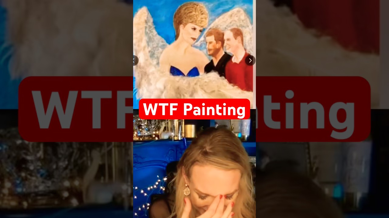
Princess Diana, William and Harry Cringe Art
RHRJen
2K views•2026-05-31

This is one of the biggest street art exhibitions in London but there’s a twist 👀 Danish
ExploringLondonCity
1K views•2026-05-30
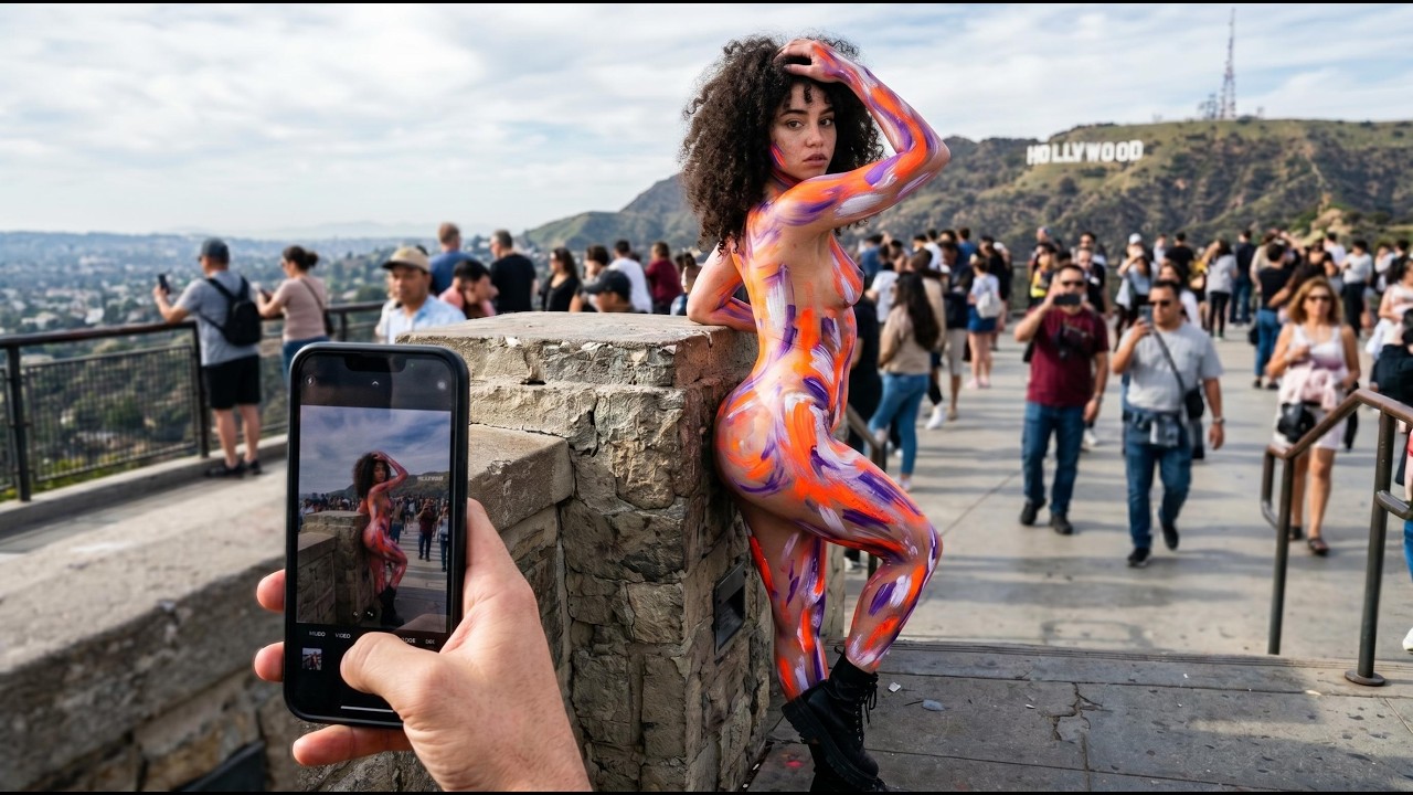
How Hollywood Body Art Changed the Way America Sees the Human Body Forever
Ink_and_Instinct
213 views•2026-06-02

Gudok Bull #4 #gudok #instruments #russia #russian #ancient #ancienthistory #sunoai #suno
aimechanicalbull
289 views•2026-05-29